- (01)Portfolio — 2026
- (02)Based in Aledo, TX
- (03)7 years of practice
- (04)Open to new roles
BluePrint Design System
A unified design system built to bring consistency, efficiency and clarity to digital financial experiences through reusable components, shared visual standards and scalable UI patterns.
01 — Overview
Building consistency at scale.
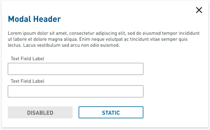
BluePrint is the UI design library behind Elevate’s digital financial products. As the company’s sole UI/UX designer, I built and maintained it as a single Figma source for color, type, spacing and components.
It is written for everyone who touches the interface: designers, developers, contractors and agency partners. The same structure carries three brand themes: the BluePrint master, RISE and Elastic.
Foundations
Color, type, grid and spacing, each documented with usage rules.
Components
39 component and pattern pages, from buttons to data tables.
Responsive
Desktop, tablet and mobile specs on 12-, 6- and 4-column grids.
Multi-brand
One structure themed for BluePrint, RISE and Elastic.
02 — The challenge
One designer, several products, one standard.
These are the goals the library was built around. Each one shows up in the file itself.
01
Keep it consistent
The same button, field or table should look and behave the same on every page, in every product.
02
Build once, reuse
Common patterns are drawn once as components, not redrawn for each project.
03
Speak developer
Spacing and type are named the way the front end names them, so specs translate directly.
04
Design in the states
Focus, error and disabled states ship with every control instead of being added later.
03 — Foundations
Color, type and spacing, decided once.
Every component draws from the same short list of decisions, each documented with where it may and may not be used.
Blueprint Blue
#35ADFF
Primary brand color. Informative notifications.
Dark Blue
#066EB9
Primary brand color.
Charcoal
#272C36
Primary brand color.
Very Green
#44A630
Primary brand color. Success states.
Warning Yellow
#FFCE00
Alert notifications.
Error Red
#D62000
Errors and notifications.
DINPro · headings, body and buttons
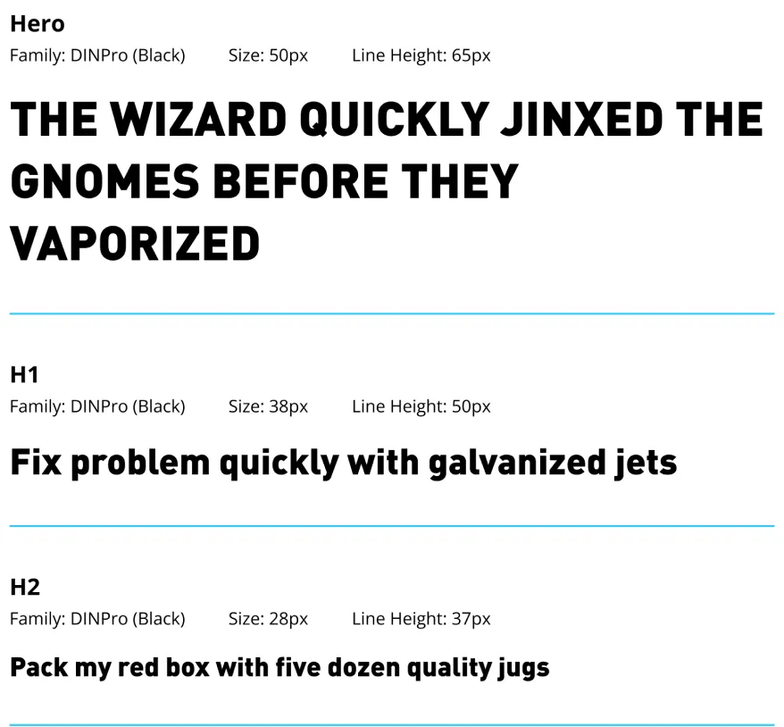
Spacing · $spacing-xxs to $spacing-xxxl
xxs
5px
xs
10px
s
15px
m
20px
l
30px
xl
40px
xxl
50px
xxxl
60px
Layout grid · three breakpoints
Desktop · 12 col
Tablet · 6 col
Mobile · 4 col
One structure, three brand themes.
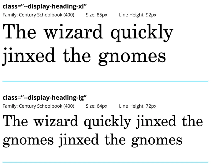
RISE and Elastic reuse the BluePrint page structure with their own palette and type scale. Their type styles are labelled with the CSS class names used in code.
BluePrint
DINPro
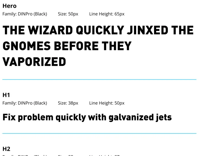
RISE
DINPro
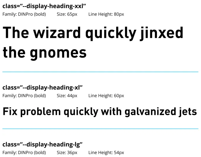
Elastic
Century Schoolbook · Benton Sans
04 — Component architecture
Every component, in every state.
Each control is drawn in its full set of states, so nothing is left to interpretation. Layer names follow an atomic scheme, from Atoms/ to Organism/.
01
Foundations
Color, type, grid and spacing
02
Atoms
Icons, checkbox and radio marks
03
Molecules
Fields, selectors and form groups
04
Organisms
Complete content blocks and forms
05
Pages
Search, 404 and application screens
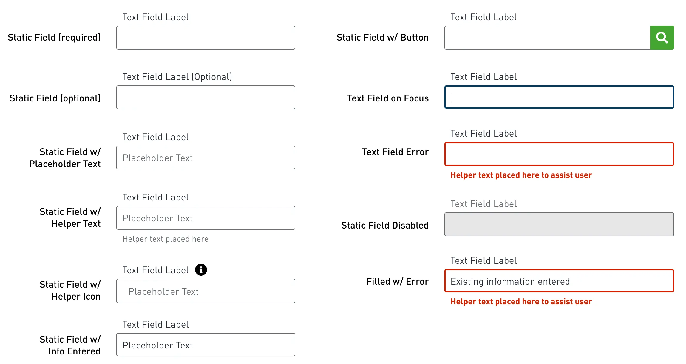
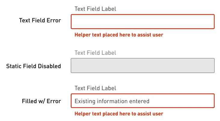
Text fields: required, optional, placeholder, helper text, helper icon, focus, error, disabled and filled with error.
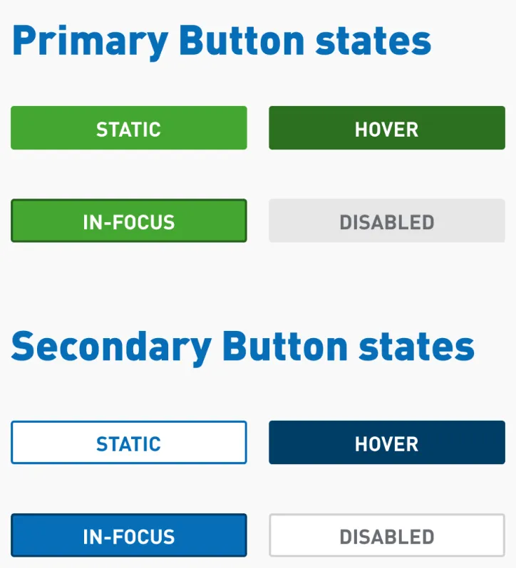
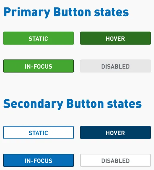
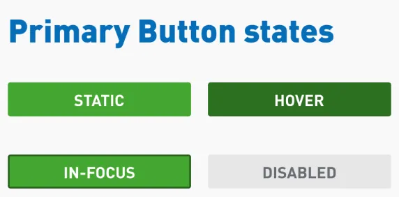
Buttons: static, hover, in-focus and disabled at each level.
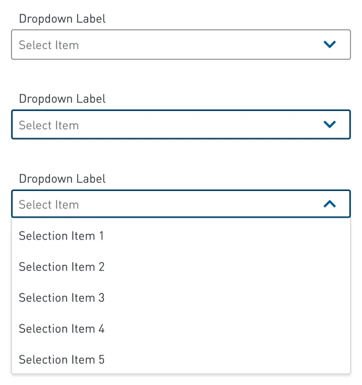
Dropdown: default, focus and open.
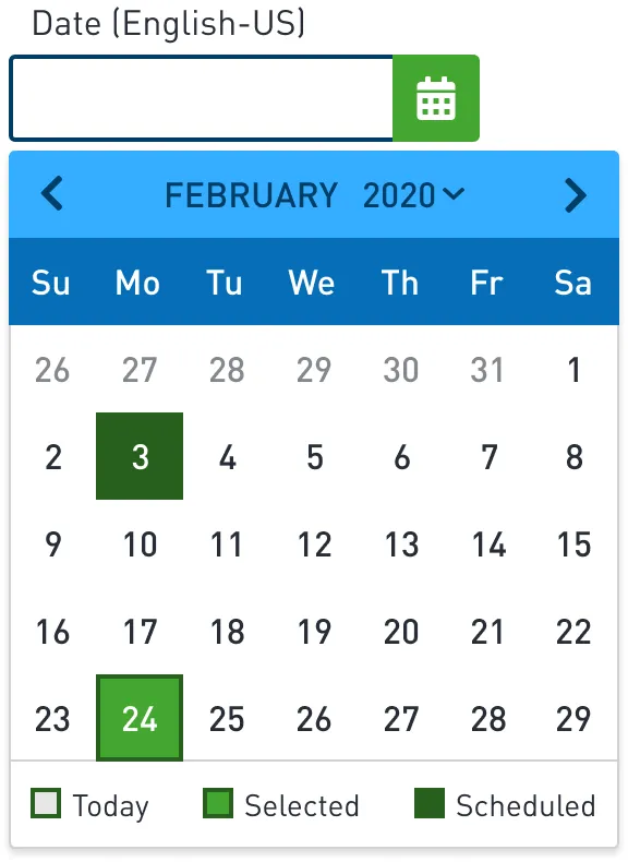
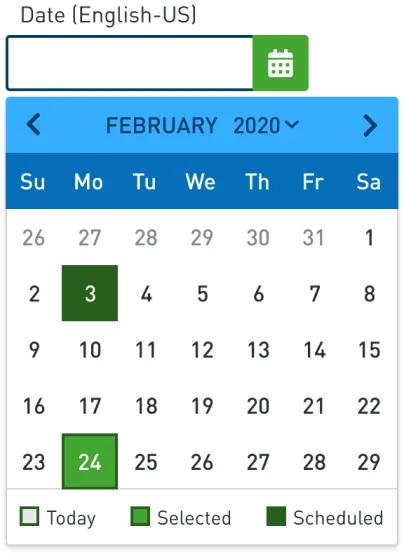
Date picker: today, selected and scheduled dates.
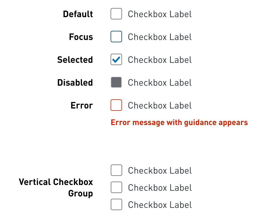
Checkboxes: five states, plus grouped layouts.
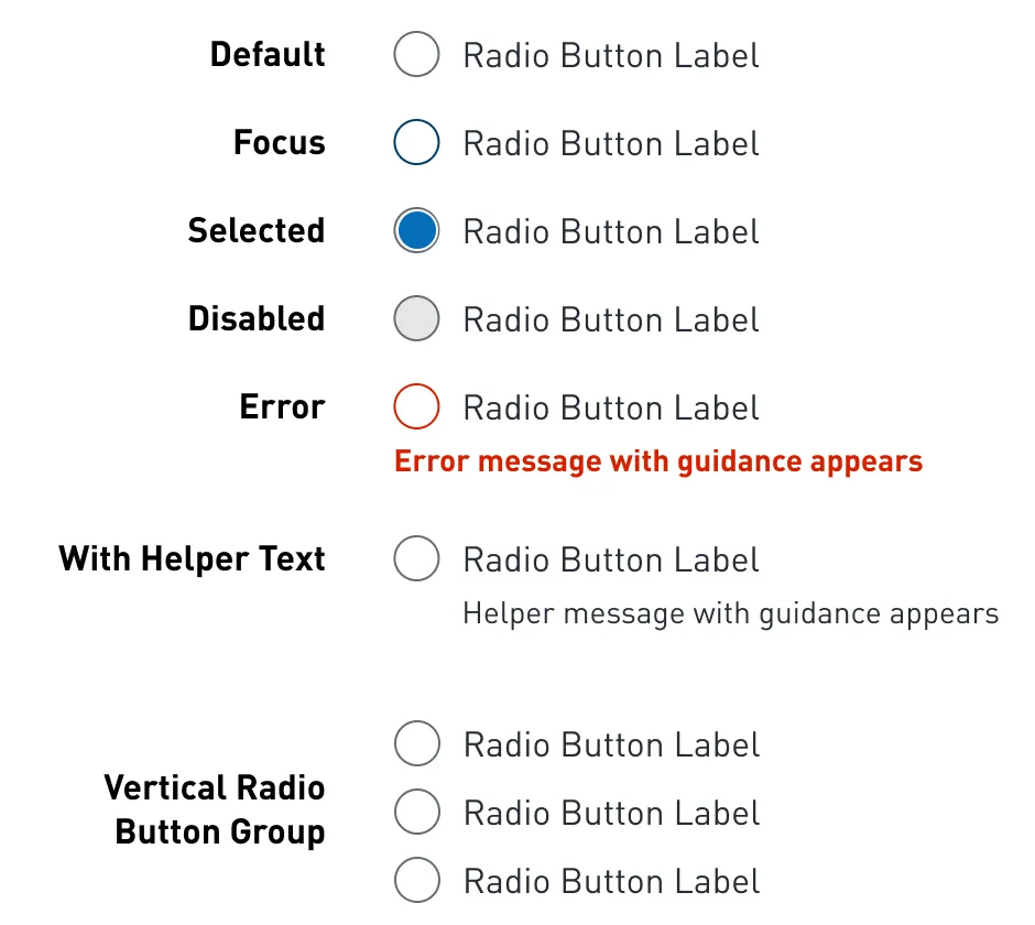
Radio buttons: the same five states, with helper text.
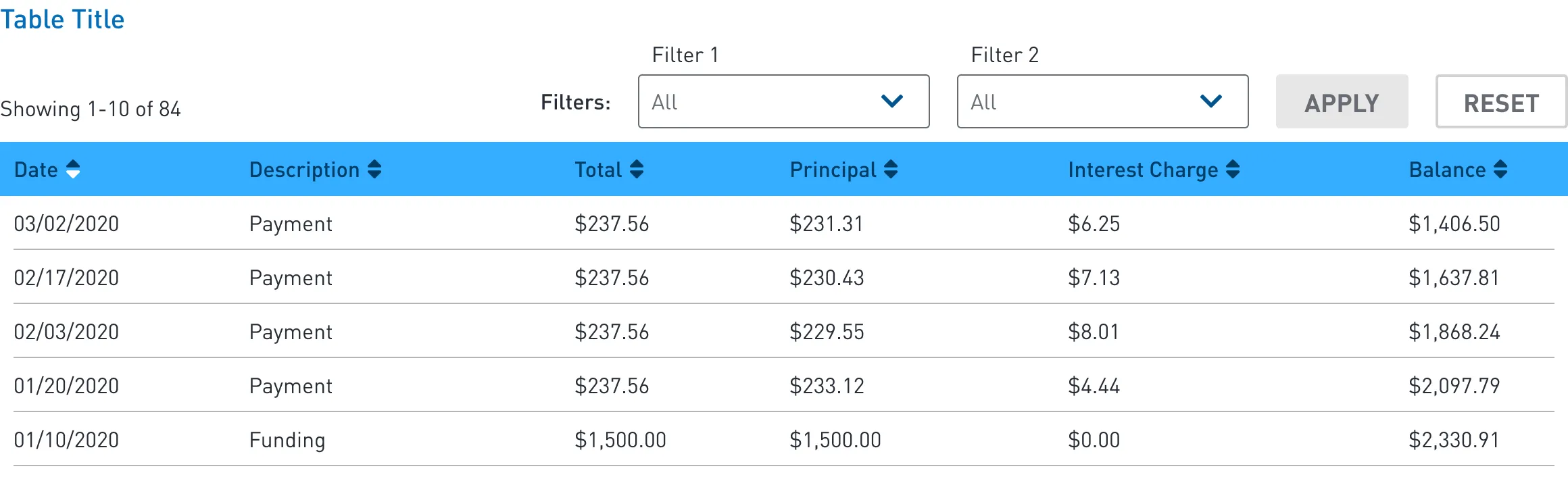
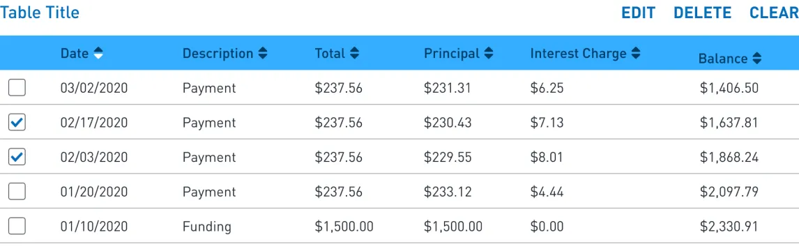
Data table with sort, filters and a results count. Variants add search, bulk actions and expandable rows.
05 — In practice
From single components to full pages.
The same fields, buttons and navigation assemble into complete screens. Every image here comes from the library file.
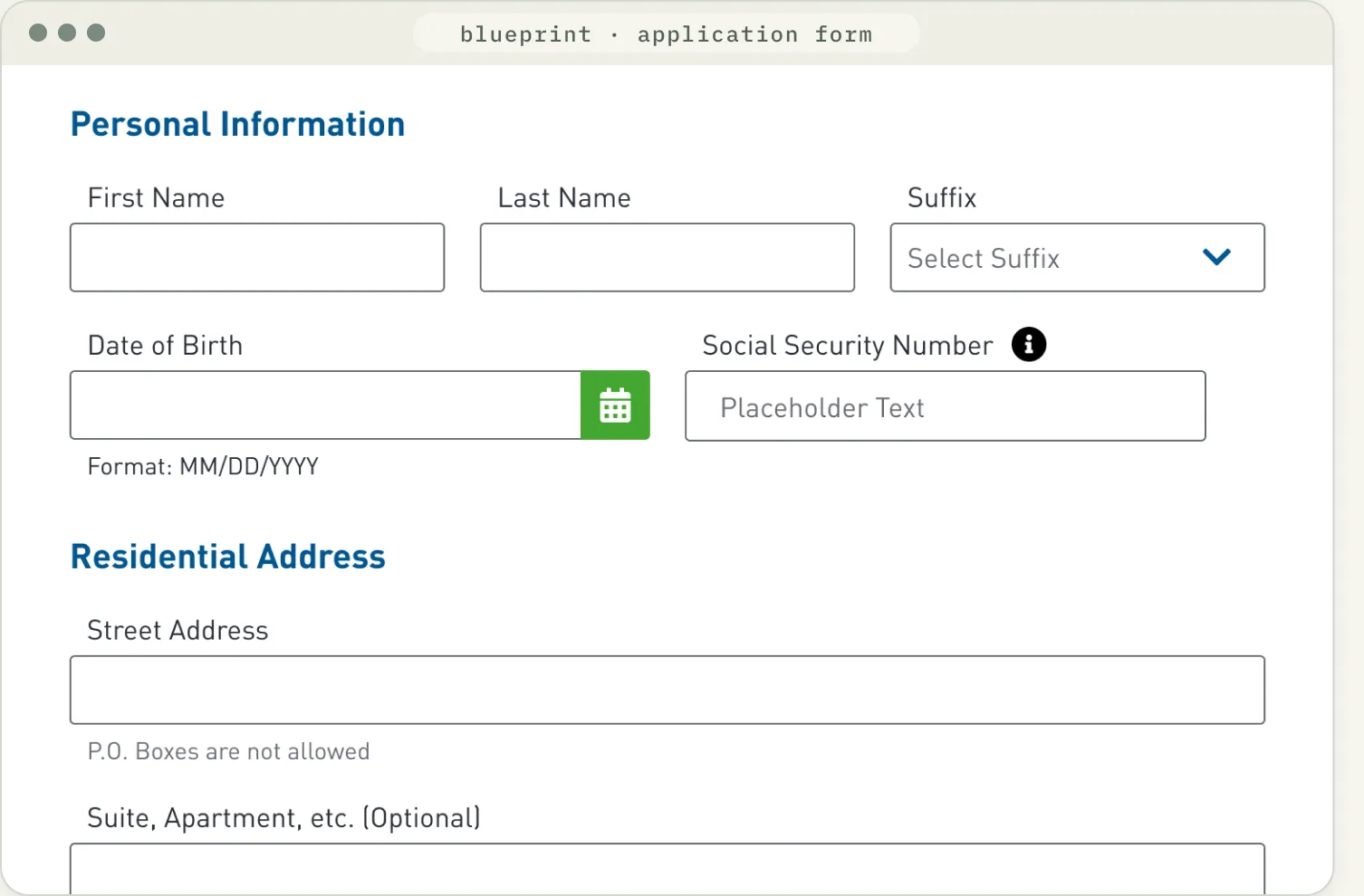
01
Grouped by heading
Sections such as Personal Information and Residential Address share one heading style.
02
Help built into the field
Format hints and rules sit directly under the input as helper text.
03
One field frame
Dropdown and date picker reuse the text field’s label, border and height.
04
Flags for sensitive inputs
An info icon marks fields that need extra explanation.
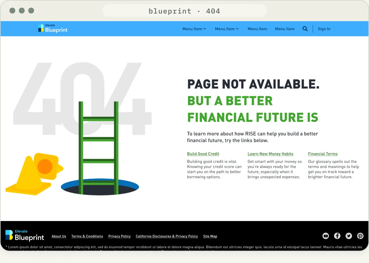
404 page: navigation, illustration, outbound links and footer, shown here with RISE copy.
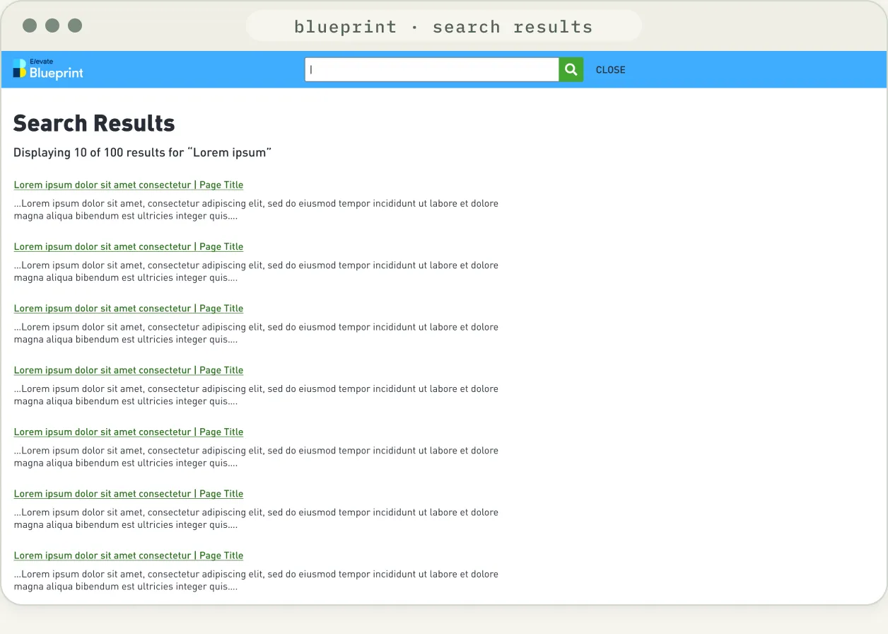
Search results: global search bar, result list and footer.
06 — Responsive
Specified for desktop, tablet and mobile.
Navigation, forms, tables and full pages are drawn at each breakpoint, so small-screen behavior is designed, not improvised.
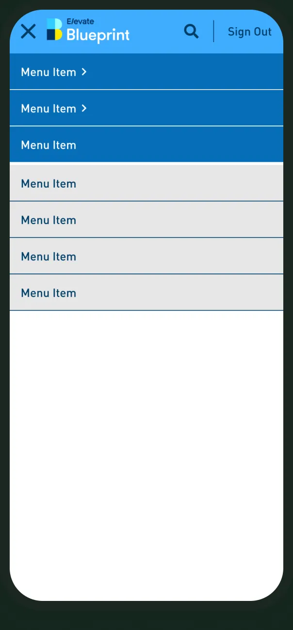
Navigation
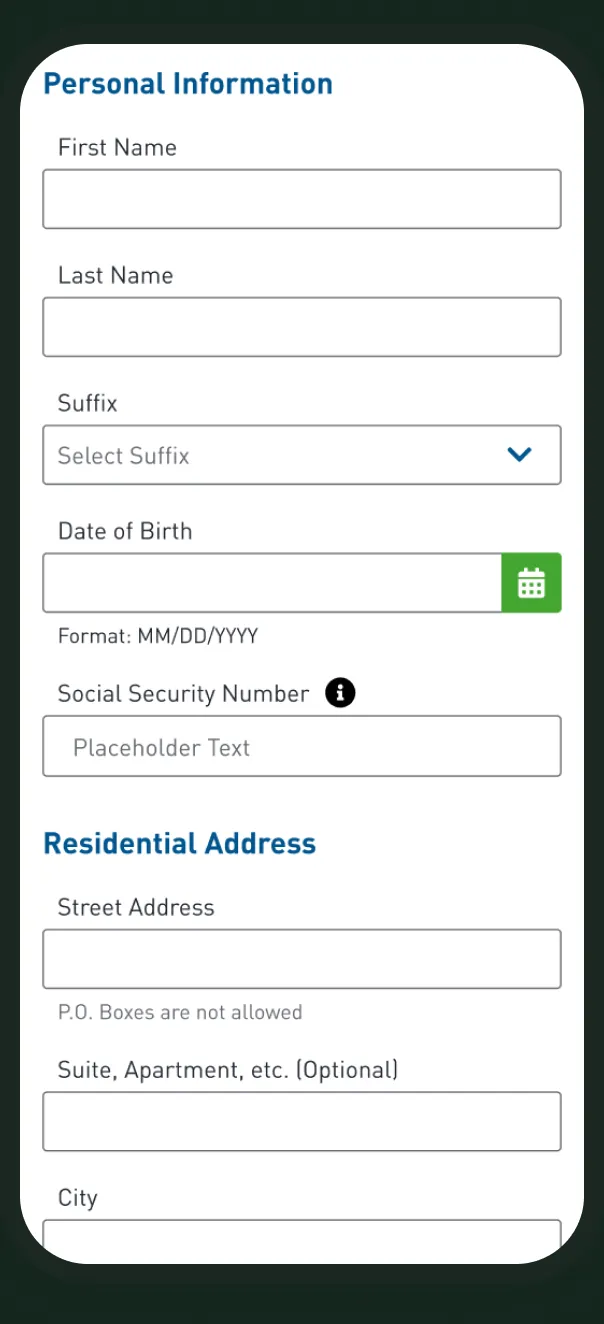
Application form
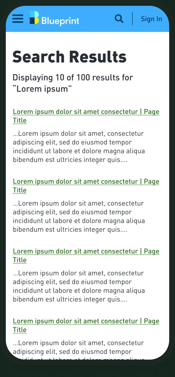
Search results
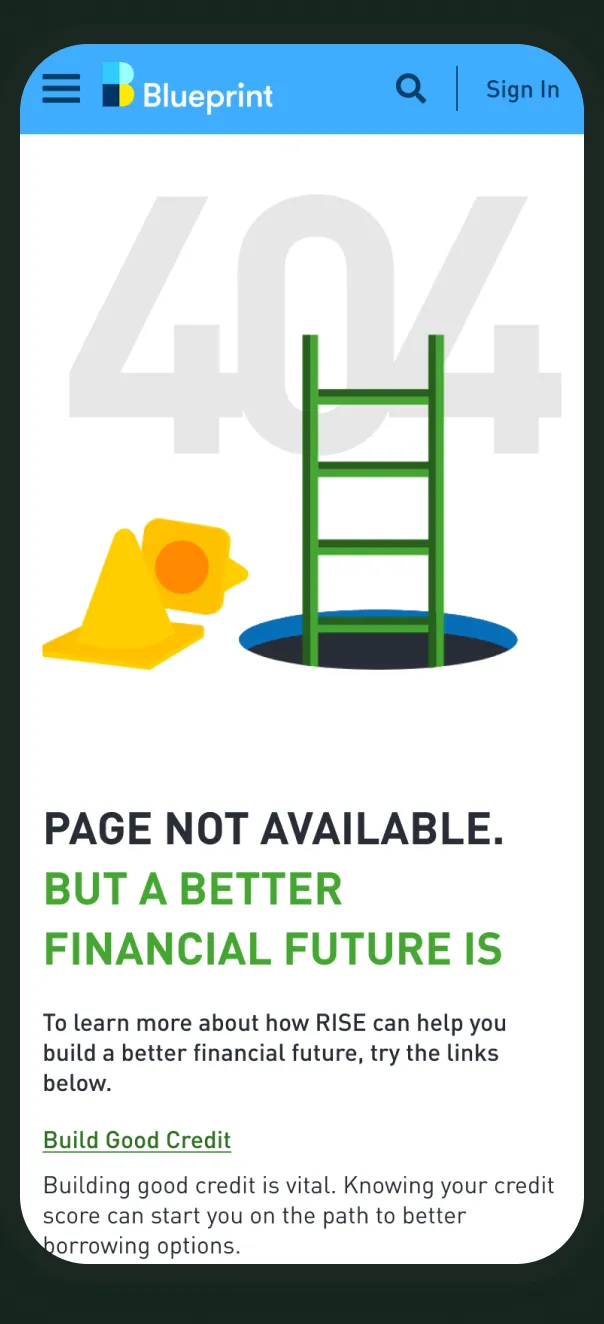
404 page
07 — Accessibility & consistency
States you can see, colors you can read.
Focus and error states are part of each component, and notification boxes pair status colors with icons. I checked the documented color pairs against WCAG contrast ratios.
Aa
14.0 : 1
Charcoal on White
Passes AA and AAA for body text.
Aa
5.3 : 1
Dark Blue on White
Passes AA for body text.
Aa
5.1 : 1
Error Red on White
Passes AA for body text.
Aa
5.7 : 1
Charcoal on Blueprint Blue
Passes AA for body text.
Aa
9.3 : 1
Charcoal on Warning Yellow
Passes AA and AAA for body text.
Aa
3.1 : 1
White on Very Green
Passes AA for large text only. Button labels are set at 18.7px bold, at the large-text threshold.
Ratios are calculated from the hex values documented in the library. This is a spot check of key color pairs, not a full WCAG conformance audit.
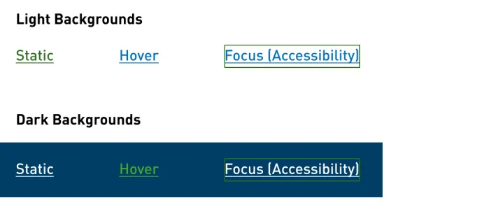
Text links carry a dedicated focus style, labelled for accessibility in the file.
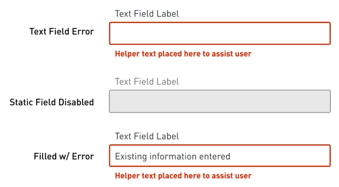
Errors pair a red border with a written message under the field.
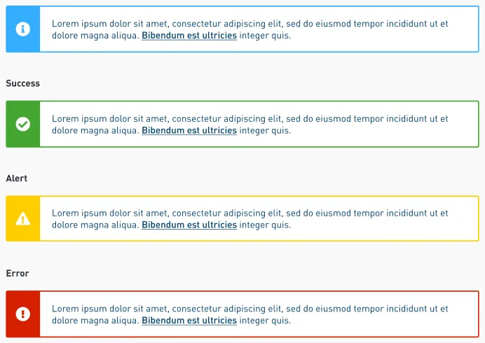
Notification boxes pair each status color with an icon, so meaning does not rely on color alone.
08 — Collaboration & workflow
Built to be handed off.
The library opens with a brief for everyone who uses it: Elevate designers, developers, contractors and agency partners.
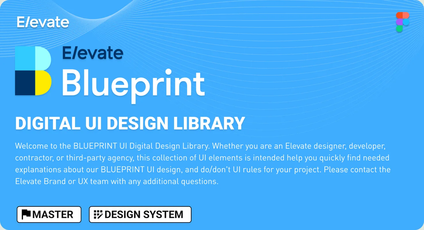
The library cover: status tags and a brief on who the file is for.
01
One master library
A single Figma file, tagged Master and Design System.
02
Tokens named like the code
Spacing steps are documented as $spacing-xxs through $spacing-xxxl.
03
Type mapped to classes
RISE and Elastic type styles carry their CSS class names, such as --display-heading-xl.
04
Rules next to the specs
Each foundation page states where a color or style may and may not be used.
09 — Outcomes & impact
What the system delivers.
One set of states, one spacing scale and one source file for every product. Counts are taken from the library file.
39
Component and pattern pages in one library
Source: BluePrint Figma file
3
Brand themes on one structure: BluePrint, RISE and Elastic
Source: BluePrint Figma file
5
States drawn for each selection control, from default to error
Source: BluePrint Figma file
10 — Reflection
A design system is mostly small decisions: a spacing step, a focus ring, an error message. Made once and made carefully, they are what make a product feel like one product.
Matt Medanich · UI/UX Designer
Next project
Paper Social Brand Guidelines 2.0
- (01)Portfolio — 2026
- (02)Based in Aledo, TX
- (03)7 years of practice
- (04)Open to new roles
BluePrint Design System
A unified design system built to bring consistency, efficiency and clarity to digital financial experiences through reusable components, shared visual standards and scalable UI patterns.
01 — Overview
Building consistency at scale.
BluePrint is the UI design library behind Elevate’s digital financial products. As the company’s sole UI/UX designer, I built and maintained it as a single Figma source for color, type, spacing and components.
It is written for everyone who touches the interface: designers, developers, contractors and agency partners. The same structure carries three brand themes: the BluePrint master, RISE and Elastic.
Foundations
Color, type, grid and spacing, each documented with usage rules.
Components
39 component and pattern pages, from buttons to data tables.
Responsive
Desktop, tablet and mobile specs on 12-, 6- and 4-column grids.
Multi-brand
One structure themed for BluePrint, RISE and Elastic.
02 — The challenge
One designer, several products, one standard.
01
Keep it consistent
The same button, field or table should look and behave the same on every page, in every product.
02
Build once, reuse
Common patterns are drawn once as components, not redrawn for each project.
03
Speak developer
Spacing and type are named the way the front end names them, so specs translate directly.
04
Design in the states
Focus, error and disabled states ship with every control instead of being added later.
03 — Foundations
Color, type and spacing, decided once.
Blueprint Blue
#35ADFF
Dark Blue
#066EB9
Charcoal
#272C36
Very Green
#44A630
Warning Yellow
#FFCE00
Error Red
#D62000
DINPro · headings, body and buttons
Spacing · eight named steps
5
10
15
20
30
40
50
60
Layout grid · three breakpoints
Desktop 12 · Tablet 6 · Mobile 4 col
One structure, three brand themes.
RISE and Elastic reuse the BluePrint page structure with their own palette and type scale. Their type styles are labelled with the CSS class names used in code.
BluePrint
DINPro
RISE
DINPro
Elastic
Century Schoolbook · Benton Sans
04 — Component architecture
Every component, in every state.
01
Foundations
Color, type, grid and spacing
02
Atoms
Icons, checkbox and radio marks
03
Molecules
Fields, selectors and form groups
04
Organisms
Complete content blocks and forms
05
Pages
Search, 404 and application screens
Text fields: error, disabled and filled with error. Nine states are documented in total.
Buttons: static, hover, in-focus and disabled at each level.
Dropdown: default, focus and open.
Date picker: today, selected and scheduled dates.
Checkboxes and radio buttons share the same five states.
05 — In practice
From single components to full pages.
01
Grouped by heading
Sections such as Personal Information and Residential Address share one heading style.
02
Help built into the field
Format hints and rules sit directly under the input as helper text.
03
One field frame
Dropdown and date picker reuse the text field’s label, border and height.
04
Flags for sensitive inputs
An info icon marks fields that need extra explanation.
404 page: navigation, illustration, links and footer, shown here with RISE copy.
Search results: global search bar, result list and footer.
06 — Responsive
Specified for desktop, tablet and mobile.
Navigation
Application form
Search results
404 page
07 — Accessibility & consistency
States you can see, colors you can read.
Focus and error states are part of each component, and notification boxes pair status colors with icons. I checked the documented color pairs against WCAG contrast ratios.
Aa
14.0 : 1
Charcoal on White
Passes AA and AAA for body text.
Aa
5.3 : 1
Dark Blue on White
Passes AA for body text.
Aa
5.1 : 1
Error Red on White
Passes AA for body text.
Aa
5.7 : 1
Charcoal on Blueprint Blue
Passes AA for body text.
Aa
9.3 : 1
Charcoal on Warning Yellow
Passes AA and AAA for body text.
Aa
3.1 : 1
White on Very Green
Passes AA for large text only. Button labels are set at 18.7px bold, at the large-text threshold.
Ratios are calculated from the hex values documented in the library. This is a spot check of key color pairs, not a full WCAG conformance audit.
Text links carry a dedicated focus style, labelled for accessibility in the file.
Errors pair a red border with a written message under the field.
Notification boxes pair each status color with an icon, so meaning does not rely on color alone.
08 — Collaboration & workflow
Built to be handed off.
The library cover: status tags and a brief for designers, developers, contractors and agency partners.
01
One master library
A single Figma file, tagged Master and Design System.
02
Tokens named like the code
Spacing steps are documented as $spacing-xxs through $spacing-xxxl.
03
Type mapped to classes
RISE and Elastic type styles carry their CSS class names, such as --display-heading-xl.
04
Rules next to the specs
Each foundation page states where a color or style may and may not be used.
09 — Outcomes & impact
What the system delivers.
One set of states, one spacing scale and one source file for every product. Counts are taken from the library file.
39
Component and pattern pages in one library
Source: BluePrint Figma file
3
Brand themes on one structure
Source: BluePrint Figma file
5
States drawn for each selection control
Source: BluePrint Figma file
10 — Reflection
A design system is mostly small decisions: a spacing step, a focus ring, an error message. Made once and made carefully, they are what make a product feel like one product.
Matt Medanich · UI/UX Designer