- (01)Portfolio — 2026
- (02)Based in Aledo, TX
- (03)7 years of practice
- (04)Open to new roles
Paper Social Brand Guidelines 2.0
A brand evolution for a family-owned stationery studio: keep what customers already love, and build a scalable system for what comes next.
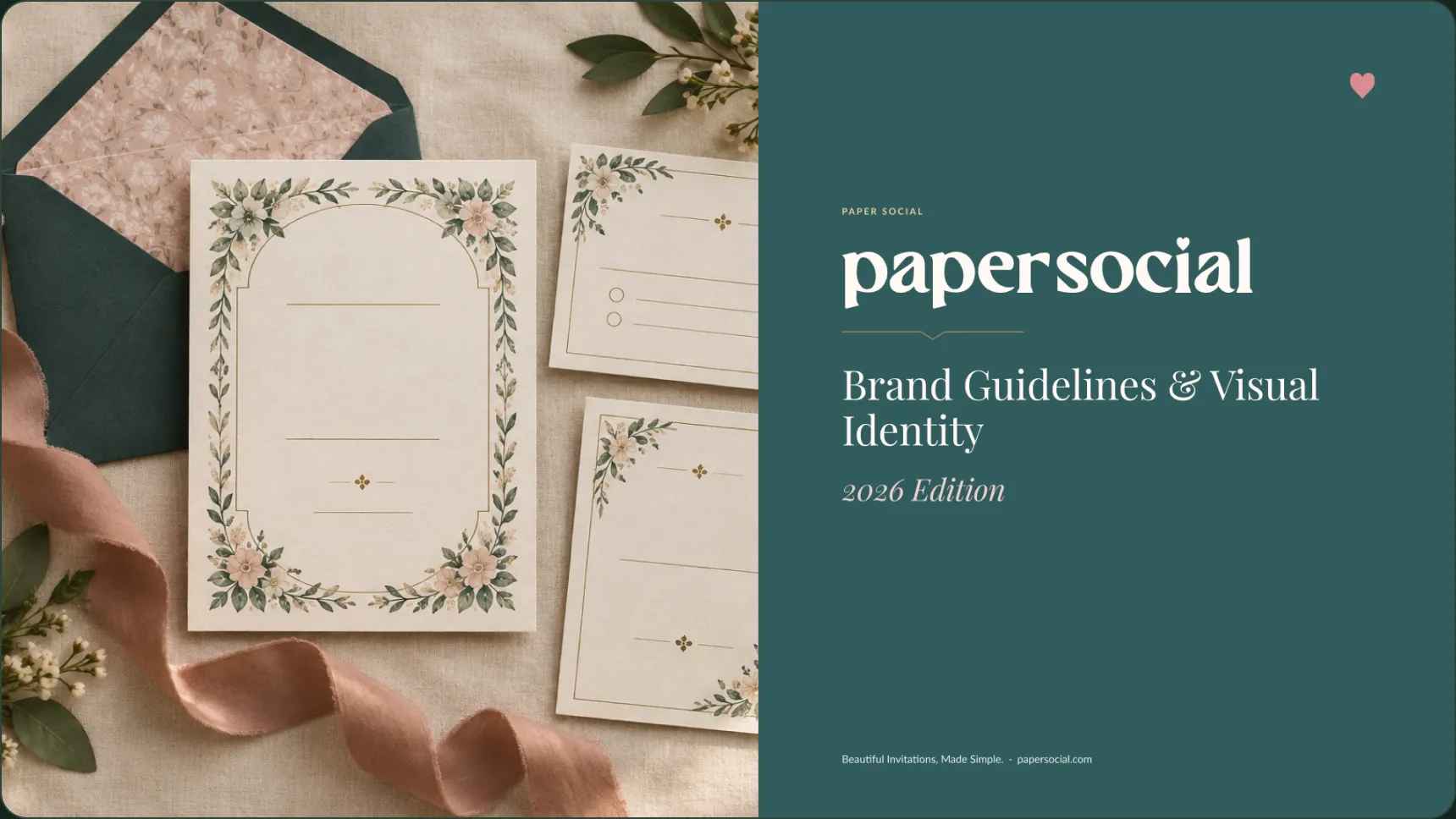
Version 2.0 · October 2026
01 — Overview
An evolution, not a rebrand.
Paper Social’s lettered wordmark, Paper Teal and Social Rose were already recognisable. Version 2.0 keeps them as drawn and adds what the 2025 guidelines lacked: one value per color, a type scale, components and accessibility standards.
The file is written for owners, designers, developers, printers and marketing partners. Every asset carries a status tag: Existing, Refined, New, Needs Approval or Retire.
Audit
Findings across identity, website and design system, scored by maturity.
Identity
Logo, color, type, graphic elements and photography direction.
Design system
57 color variables, 26 text styles and a component kit.
Applications
E-commerce, print, packaging, social and email.
02 — The challenge
A loved brand with a thin rulebook.
The audit scored the visual identity 4 out of 5, the website 2 and the design system 1.
01
Conflicting colors
Eight values in circulation, including three near-duplicate pinks.
02
No type scale
Bold headings and light body copy, with no defined sizes.
03
Nothing reusable
Logos lived as flattened PNGs. There were no tokens or components.
04
No accessibility standard
Contrast, focus and target sizes were undocumented.
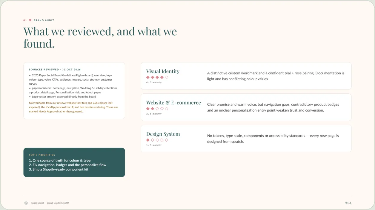
Audit summary: three areas scored, with the top three priorities.
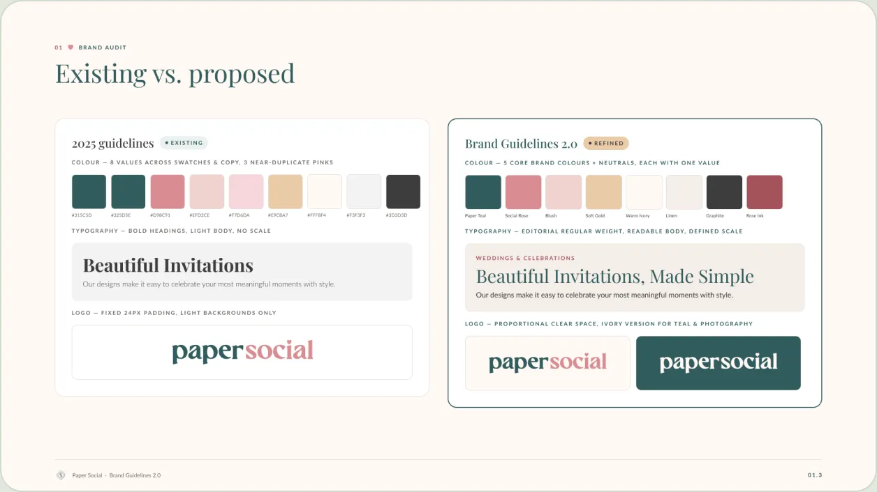
Existing vs. proposed: the 2025 guidelines beside version 2.0.
03 — Visual language
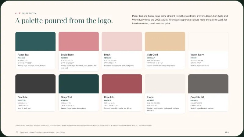
A palette poured from the logo.
Five core brand colors and a set of neutrals, each with one value. Playfair Display for headings, Lato for everything else.
Paper Teal
#315C5D
Logo, headings, primary buttons
Social Rose
#D98C91
Logo, illustration, large graphics
Blush
#EFD2CE
Backgrounds, liners, soft panels
Soft Gold
#E9CBA7
Dividers, foil, celebratory details
Warm Ivory
#FFF8F4
Page background
Graphite
#3D3D3D
Body text
Playfair Display · headings
Beautiful Invitations, Made Simple
Lato · body, labels and UI
Our designs make it easy to celebrate your most meaningful moments with style.
Personalize me
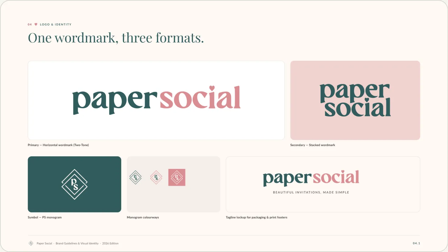
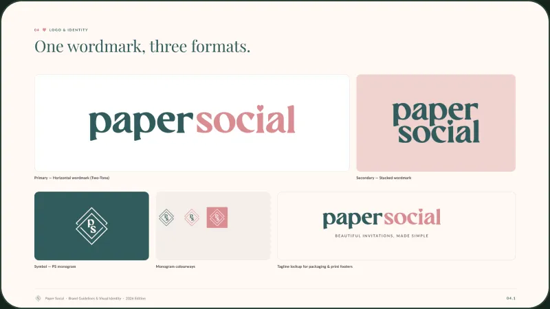
One wordmark, three formats: horizontal, stacked and the PS monogram. The existing artwork is kept as drawn.
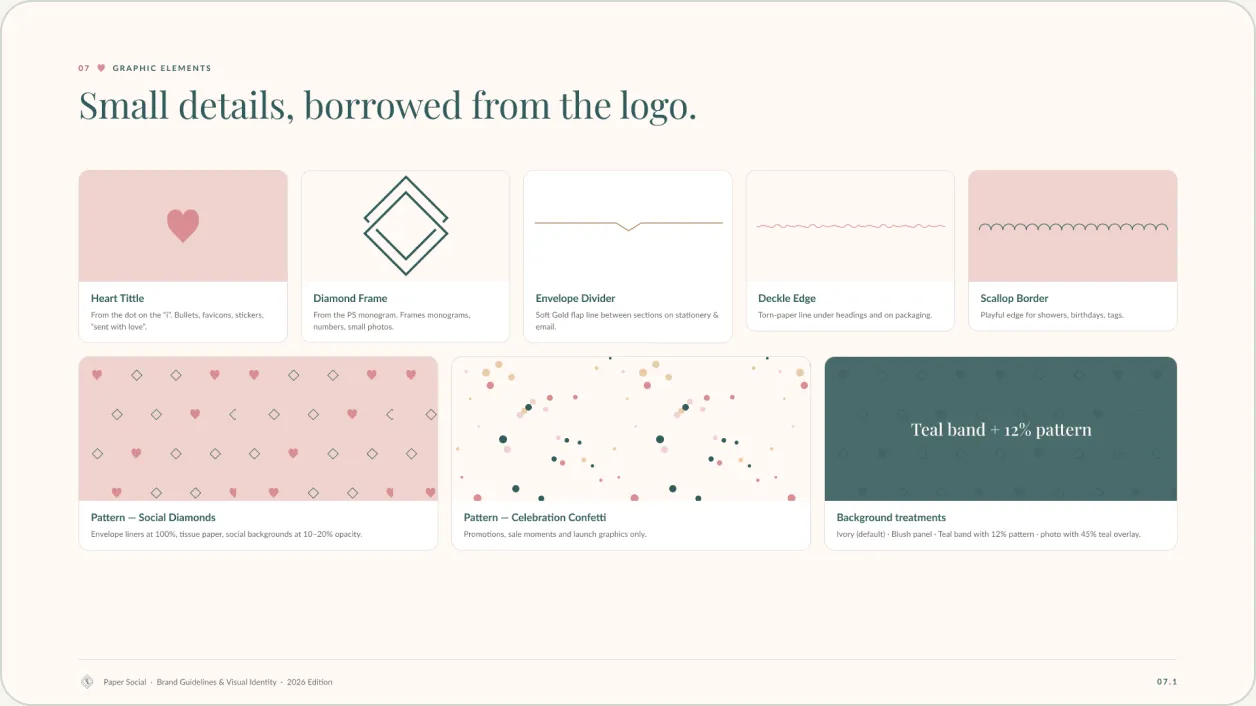
Graphic elements borrowed from the logo: the heart tittle, diamond frame and two patterns.
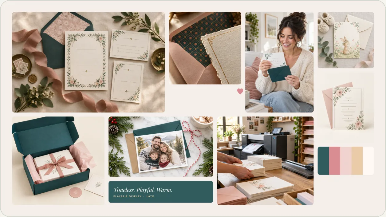
Mood board. The photographs are AI-generated art-direction references, not product photography.
04 — Structure
From audit to application.
Fifteen sections take the brand from findings to finished touchpoints.
01
Audit
What exists and what to fix
02
Strategy
Foundations, values and audience
03
Identity
Logo, color, type and imagery
04
System
Tokens, components and states
05
Applications
Web, print, social and email
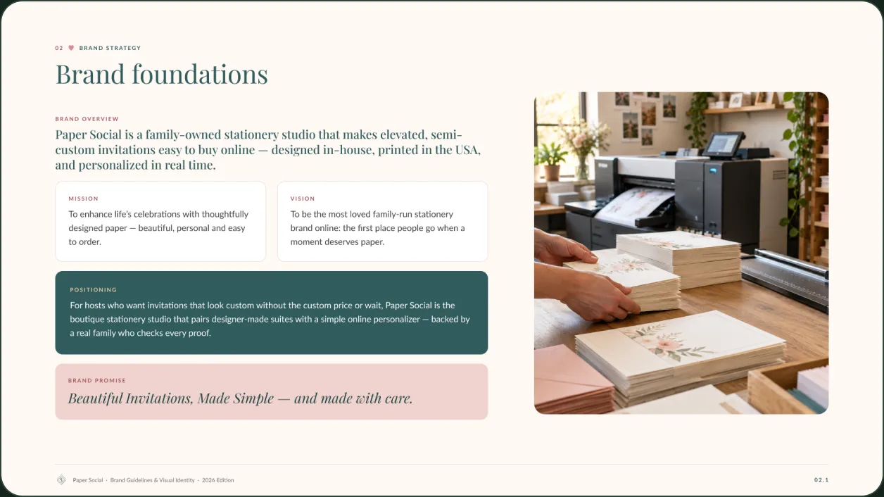
Brand foundations: overview, mission, vision, positioning and promise, each tagged by status.
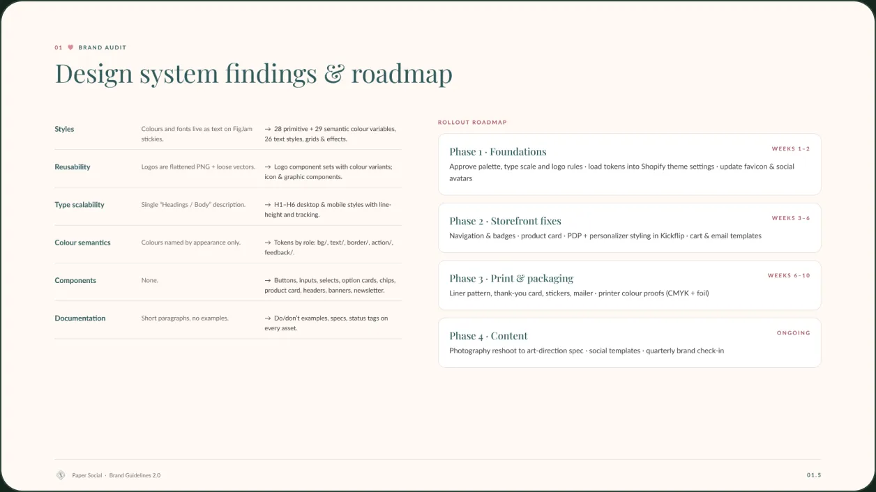
Design system findings and a four-phase rollout roadmap.
05 — Design system
A component kit built on tokens.
01
Tokens by role
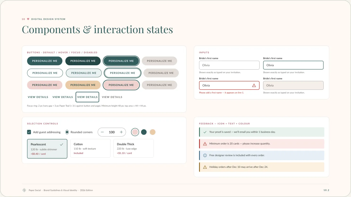
Colors are named for their job: bg, text, border, action and feedback.
02
Every state drawn
Buttons and inputs show default, hover, focus and disabled.
03
Feedback beyond color
Messages combine an icon, text and color.
04
Responsive type
H1 to H6 are defined for desktop and mobile.
06 — Applications
One system across screen, print and social.
These are proposed applications, shown as the guidelines present them. None is live yet.
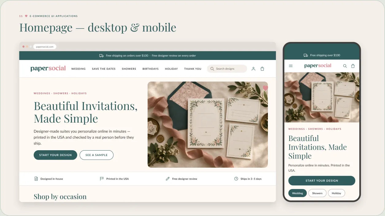
Homepage, desktop and mobile.
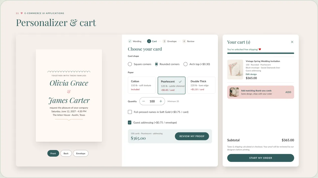
Personalizer and cart: a four-step flow with a running price.
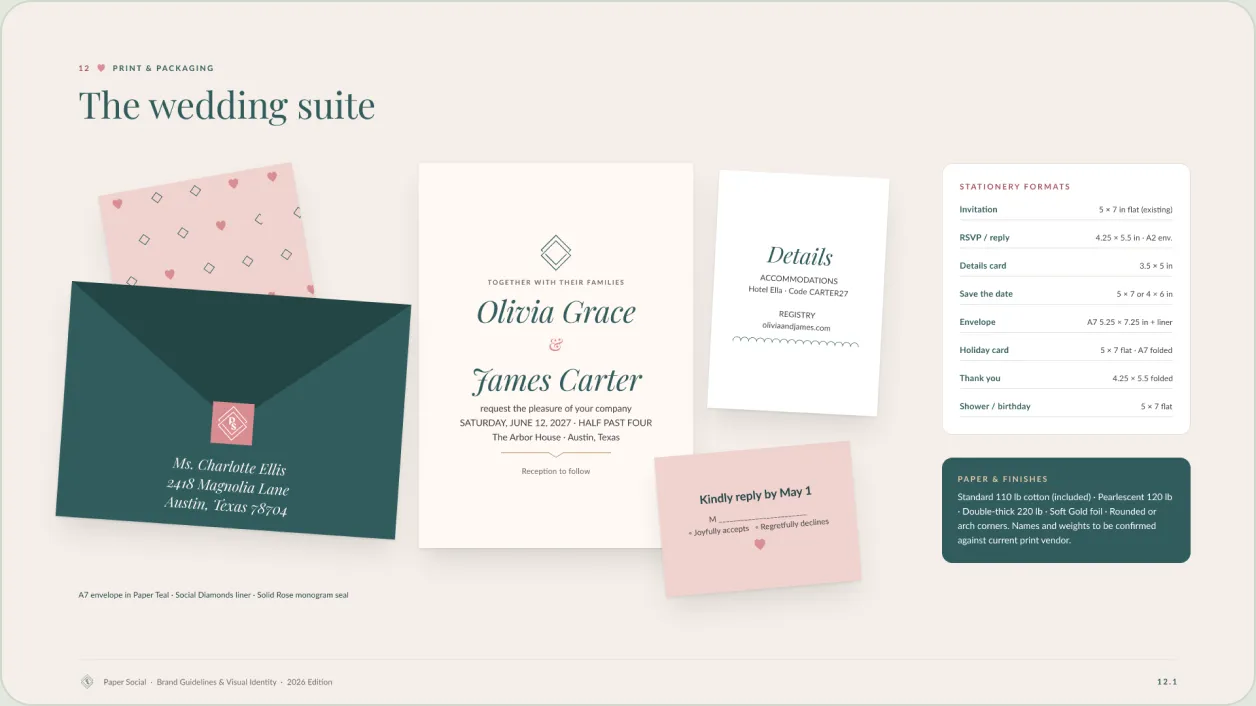
The wedding suite: invitation, details card, reply card and lined envelope.
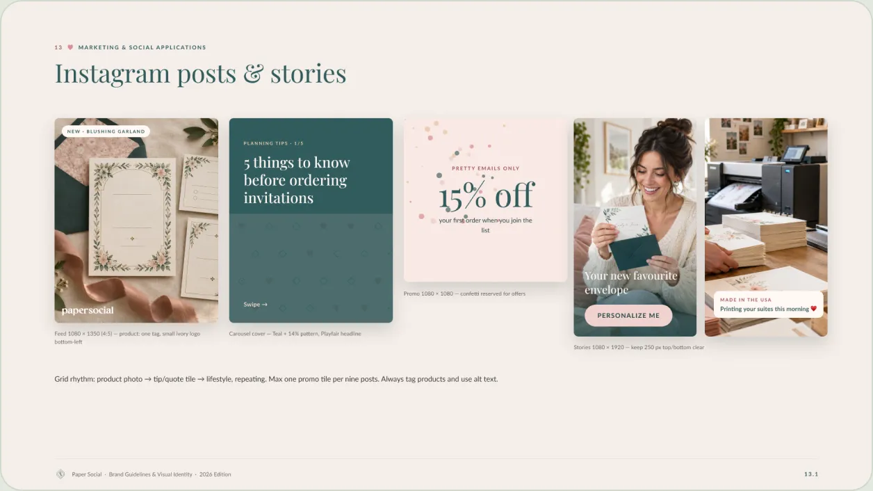
Instagram posts and stories, with a grid rhythm rule.
07 — Accessibility
Accessible by default.
The guidelines set WCAG 2.2 AA as the baseline and say which brand colors can carry text.
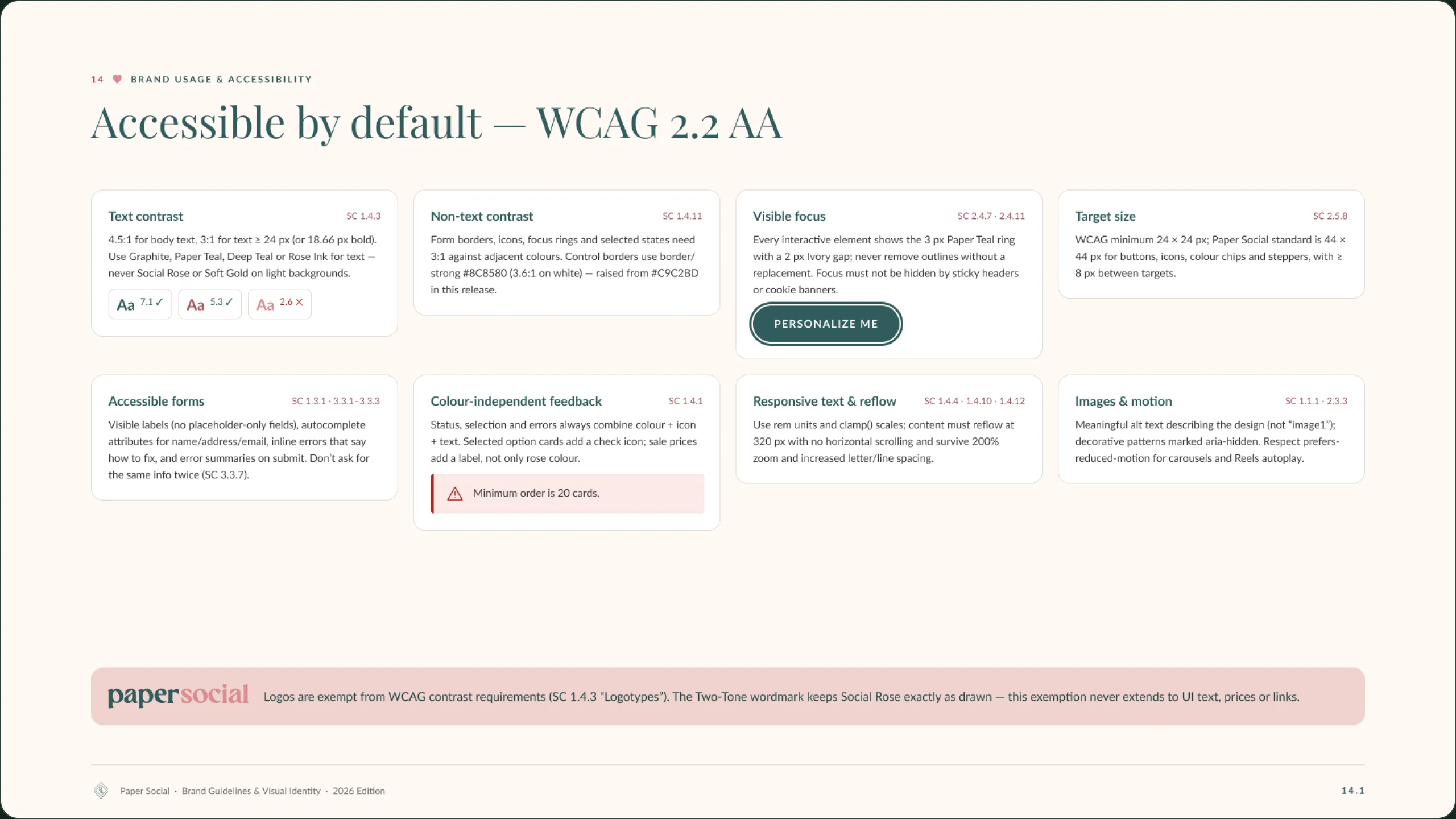
Social Rose measures 2.6:1 on white, so the system adds Rose Ink for text and links.
08 — Reflection
The hardest part of evolving a brand people already love is deciding what not to touch. Much of this work was writing down what was already right.
Matt Medanich · Brand and UI/UX Designer
09 — Outcomes
What the guidelines deliver.
Version 2.0 is a proposal to the owners, with rollout planned in four phases. Counts are taken from the file.
30
Pages in the 2026 PDF edition
Source: guidelines Figma file
57
Color variables: 28 primitive and 29 semantic
Source: guidelines Figma file
26
Text styles across desktop and mobile
Source: guidelines Figma file
Next project
Tri-County Bank
- (01)Portfolio — 2026
- (02)Based in Aledo, TX
- (03)7 years of practice
- (04)Open to new roles
Paper Social Brand Guidelines 2.0
A brand evolution for a family-owned stationery studio: keep what customers already love, and build a scalable system for what comes next.
01 — Overview
An evolution, not a rebrand.
Paper Social’s lettered wordmark, Paper Teal and Social Rose were already recognisable. Version 2.0 keeps them as drawn and adds what the 2025 guidelines lacked: one value per color, a type scale, components and accessibility standards.
The file is written for owners, designers, developers, printers and marketing partners. Every asset carries a status tag: Existing, Refined, New, Needs Approval or Retire.
Audit
Findings across identity, website and design system, scored by maturity.
Identity
Logo, color, type, graphic elements and photography direction.
Design system
57 color variables, 26 text styles and a component kit.
Applications
E-commerce, print, packaging, social and email.
02 — The challenge
A loved brand with a thin rulebook.
01
Conflicting colors
Eight values in circulation, including three near-duplicate pinks.
02
No type scale
Bold headings and light body copy, with no defined sizes.
03
Nothing reusable
Logos lived as flattened PNGs. There were no tokens or components.
04
No accessibility standard
Contrast, focus and target sizes were undocumented.
Audit summary: three areas scored, with the top three priorities.
Existing vs. proposed: the 2025 guidelines beside version 2.0.
03 — Visual language
A palette poured from the logo.
Paper Teal
#315C5D
Social Rose
#D98C91
Blush
#EFD2CE
Soft Gold
#E9CBA7
Warm Ivory
#FFF8F4
Graphite
#3D3D3D
Playfair Display · headings
Beautiful Invitations, Made Simple
Lato · body, labels and UI
Our designs make it easy to celebrate your most meaningful moments with style.
One wordmark, three formats. The existing artwork is kept as drawn.
Graphic elements borrowed from the logo: the heart tittle, diamond frame and two patterns.
Mood board. The photographs are AI-generated art-direction references, not product photography.
04 — Structure
From audit to application.
01
Audit
What exists and what to fix
02
Strategy
Foundations, values and audience
03
Identity
Logo, color, type and imagery
04
System
Tokens, components and states
05
Applications
Web, print, social and email
Brand foundations: overview, mission, vision, positioning and promise, each tagged by status.
Design system findings and a four-phase rollout roadmap.
05 — Design system
A component kit built on tokens.
01
Tokens by role
Colors are named for their job: bg, text, border, action and feedback.
02
Every state drawn
Buttons and inputs show default, hover, focus and disabled.
03
Feedback beyond color
Messages combine an icon, text and color.
04
Responsive type
H1 to H6 are defined for desktop and mobile.
06 — Applications
One system across screen, print and social.
These are proposed applications, shown as the guidelines present them. None is live yet.
Homepage, desktop and mobile.
Personalizer and cart: a four-step flow with a running price.
The wedding suite: invitation, details card, reply card and lined envelope.
Instagram posts and stories, with a grid rhythm rule.
07 — Accessibility
Accessible by default.
The guidelines set WCAG 2.2 AA as the baseline and say which brand colors can carry text.
Social Rose measures 2.6:1 on white, so the system adds Rose Ink for text and links.
08 — Reflection
The hardest part of evolving a brand people already love is deciding what not to touch. Much of this work was writing down what was already right.
Matt Medanich · Brand and UI/UX Designer
09 — Outcomes
What the guidelines deliver.
Version 2.0 is a proposal to the owners, with rollout planned in four phases. Counts are taken from the file.
30
Pages in the 2026 PDF edition
Source: guidelines Figma file
57
Color variables
Source: guidelines Figma file
26
Text styles across desktop and mobile
Source: guidelines Figma file