- (01)Portfolio — 2026
- (02)Based in Aledo, TX
- (03)7 years of practice
- (04)Open to new roles
The Tri-County Bank
A website redesign for a Nebraska community bank founded in 1945, built around one promise: bank with people you know.
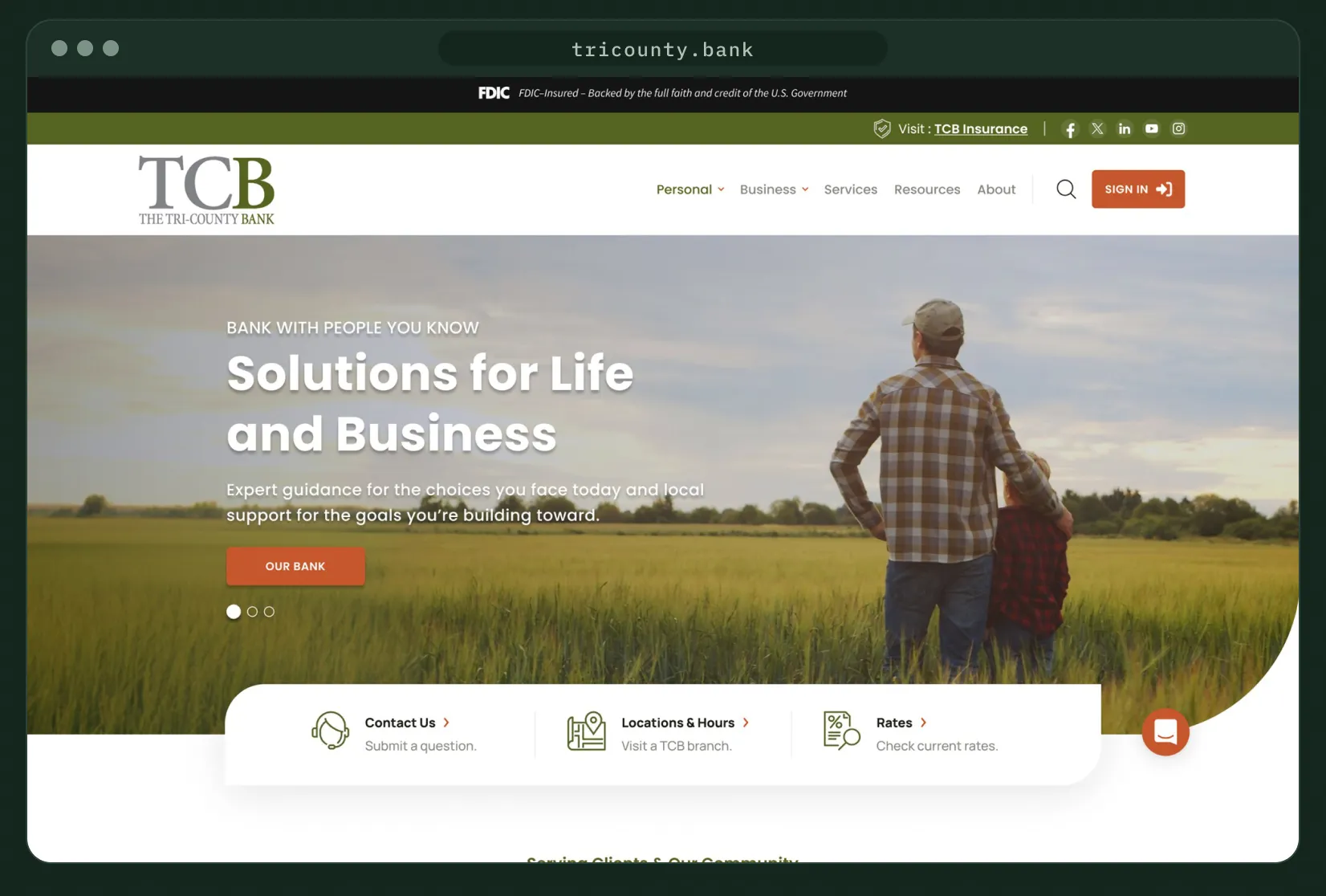
Live at tricounty.bank
01 — Overview
Bank with people you know, online.
The Tri-County Bank has served north-central Nebraska since 1945. As a UI/UX designer at Kasasa, I designed its new website: the homepage, page templates, navigation, online banking login and a companion site for TCB Insurance.
I worked from a shared brief with copy, through site map and lo-fi wireframe, to approved designs handed to development. The site is live at tricounty.bank.
Homepage
Nine sections, from a purpose-driven hero to branch locations.
Page templates
List, product and details layouts for the pages downstream.
Navigation
A mega menu that sorts personal products into four groups.
Insurance microsite
A companion homepage for TCB Insurance in the same visual system.
02 — The challenge
More bank than people expected.
The brief named a perception gap: customers knew the bank, but not everything it offers.
01
Show the full range
Surface loans, mortgages, business and digital services without crowding the page.
02
Two clear paths
Make Personal and Business banking obvious from the first screen.
03
Teach to build trust
Give fraud, cybersecurity and financial education a permanent place.
04
Modernize gently
Update the look without losing long-time customers.
03 — Visual language
Olive, rust and open country.
A palette drawn from the bank’s mark and the land around it, one sans-serif family and photography of fields, families and farm work.
Olive
#566422
Top bar, eyebrows, feature panels
Rust
#C6572C
Buttons and bullet markers
Charcoal
#1F1E17
Headings and footer
Stone
#878680
Body text
Mist
#EBEBEB
Cards and tab tracks
White
#FFFFFF
Page background
Poppins Bold · headings
Solutions for Life and Business
Poppins Regular · body, SemiBold · buttons
Expert guidance for the choices you face today and local support for the goals you’re building toward.
Compare accounts
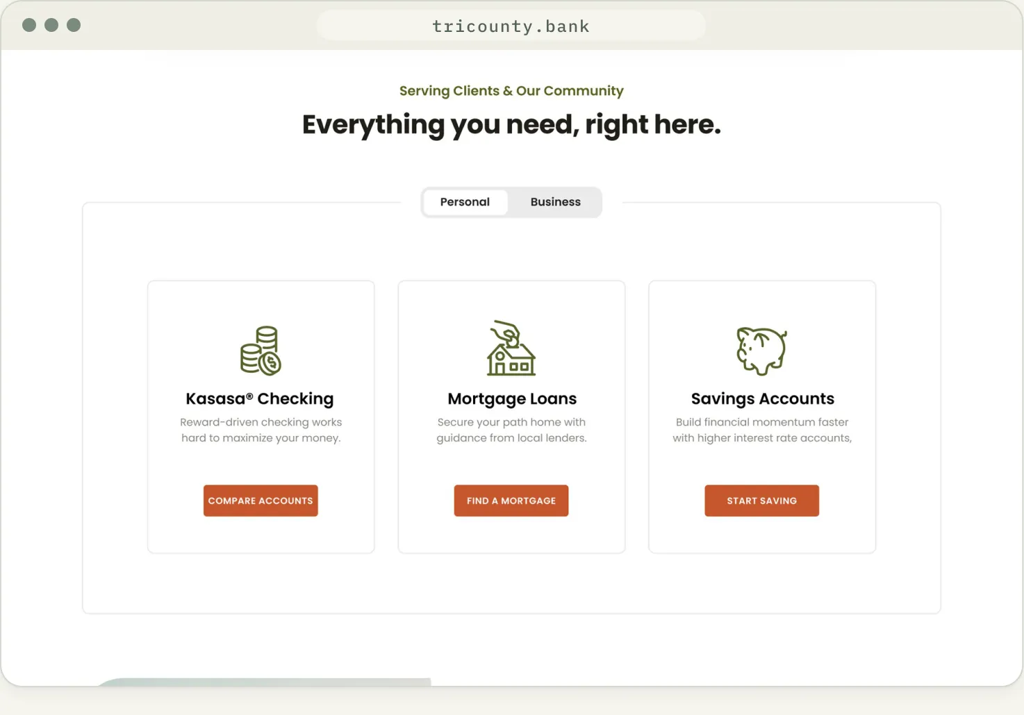
Olive line icons lead each product card; rust is reserved for actions.
04 — Process
From kickoff notes to launch.
Each stage had its own page in the working file, tracked with a status tag.
01
Collab
Goals, audience and brand notes
02
Site map
Every page typed and placed
03
Wireframe
Lo-fi layout and section order
04
Design
Hi-fi pages through approval
05
Launch
Handed to development, now live
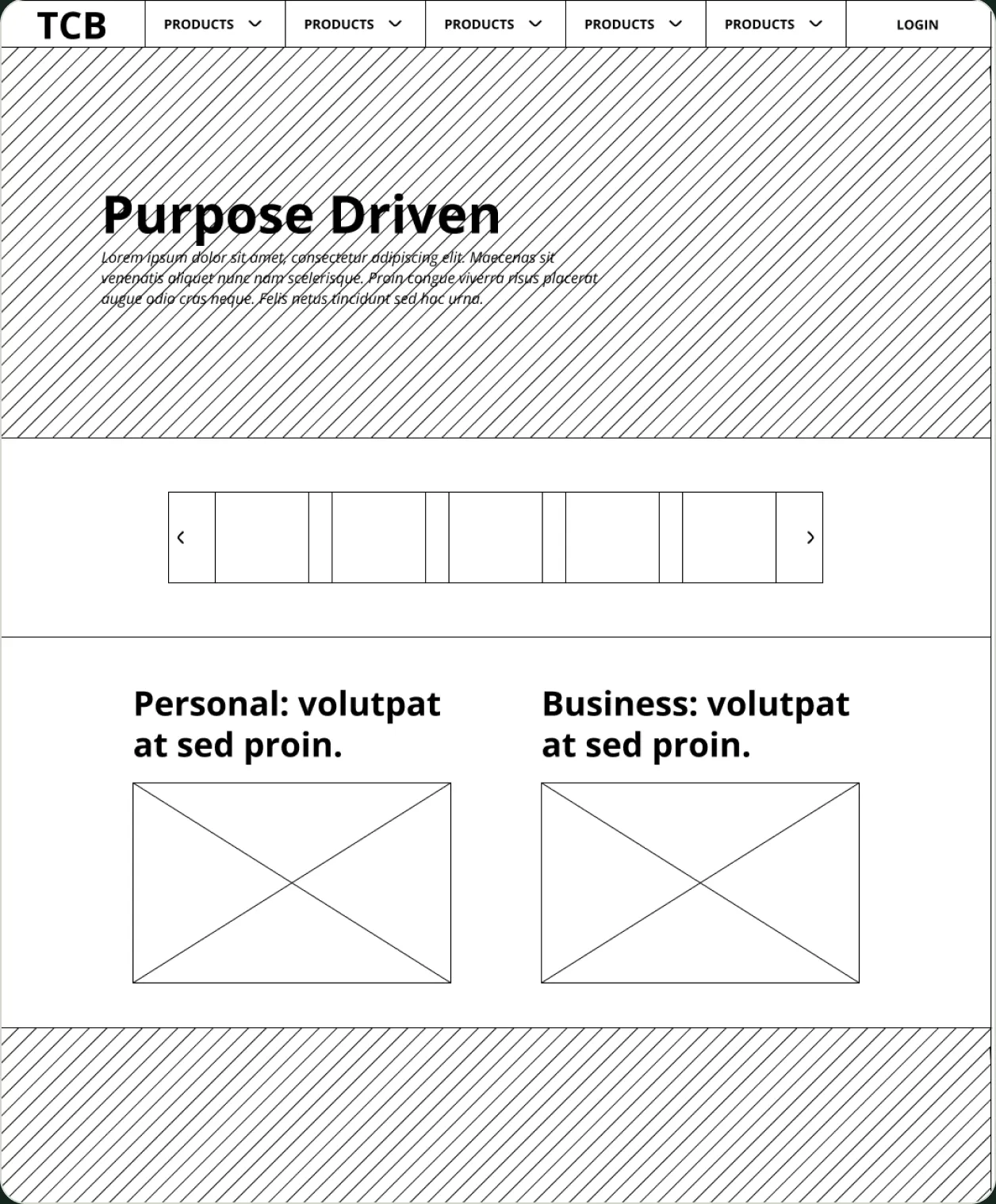
Lo-fi wireframe: section order and groupings agreed before any visual design.
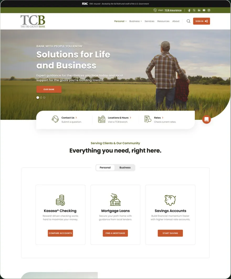
Approved homepage: the same order, with the map idea resolved as a locations panel.
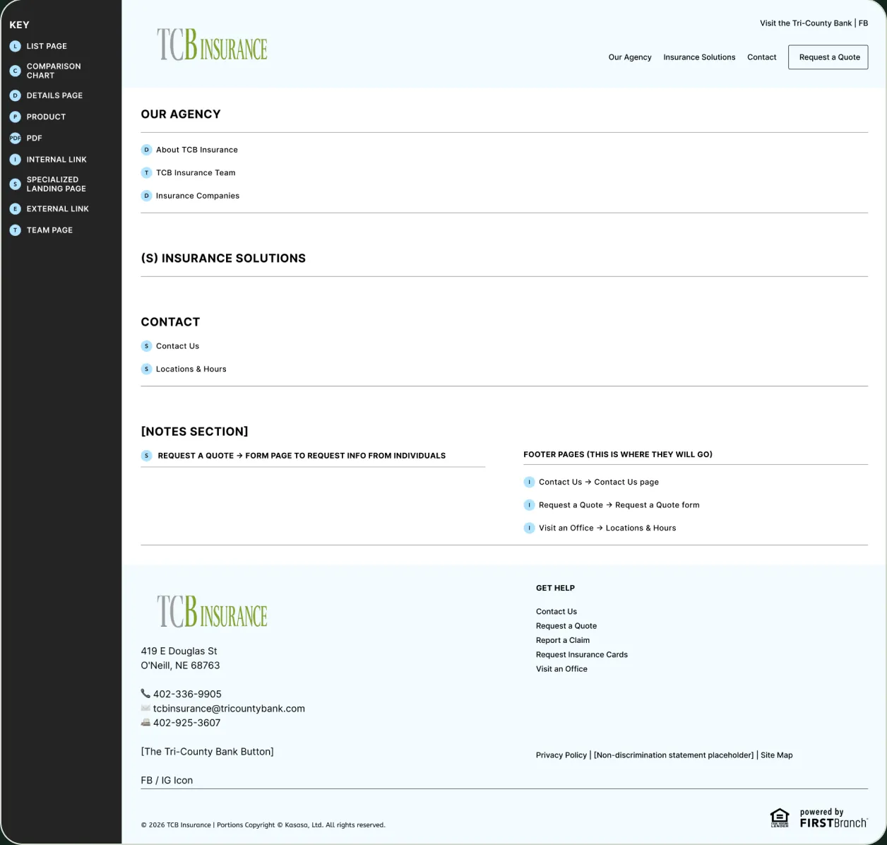
Site map for the TCB Insurance microsite, with a key for each page type.
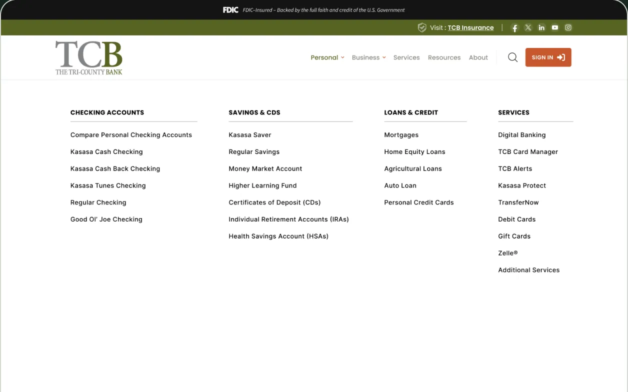
Personal menu: products sorted into four groups.
05 — Homepage
A homepage that leads with purpose, not promotions.
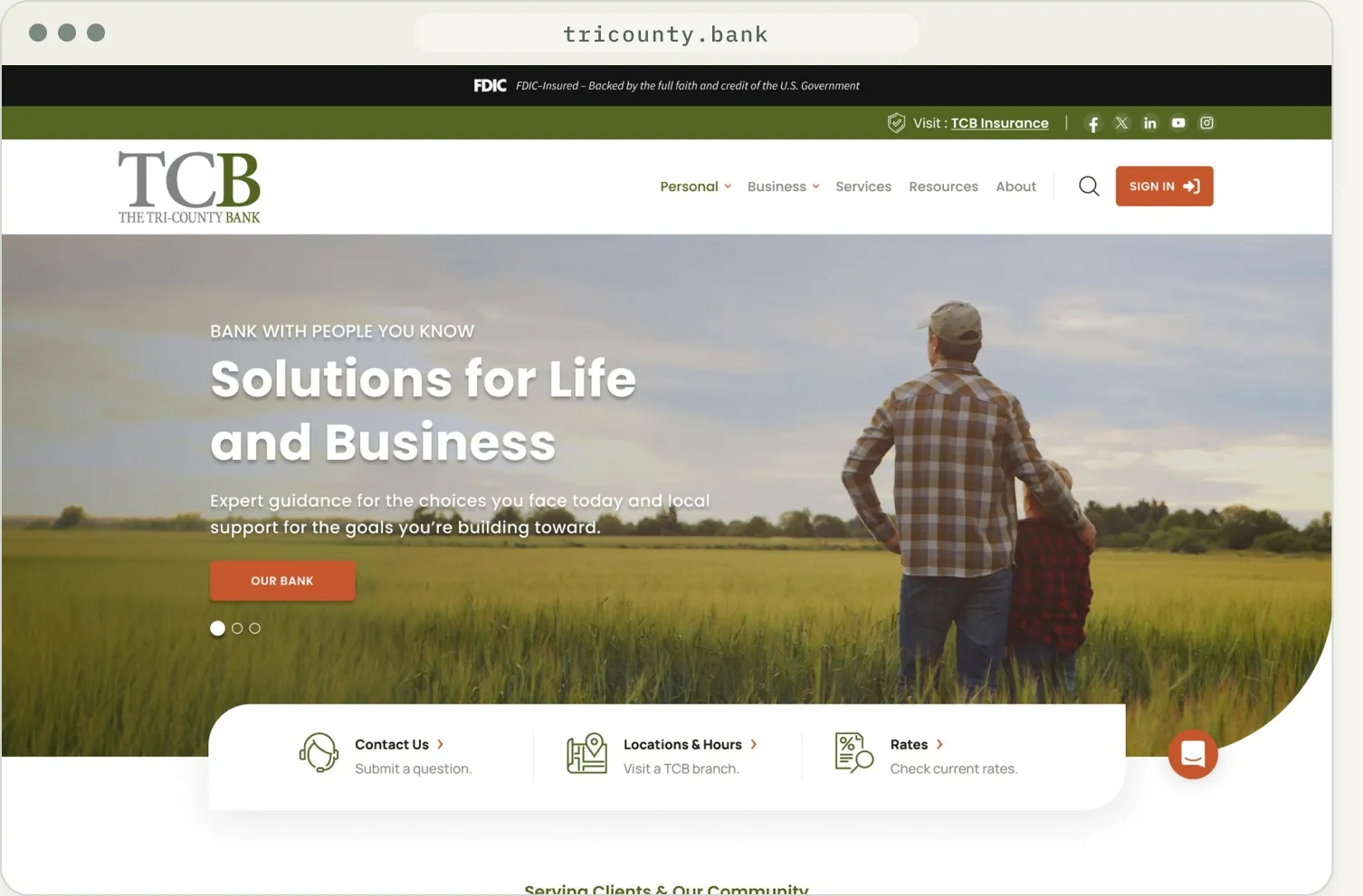
01
Utility strip
FDIC notice, insurance link and sign-in stay visible above the header.
02
Purpose-driven hero
One message and one action over wide rural photography.
03
Quick access
Contact, locations and rates sit directly under the hero.
04
One accent for action
Rust is used only for buttons and sign-in.
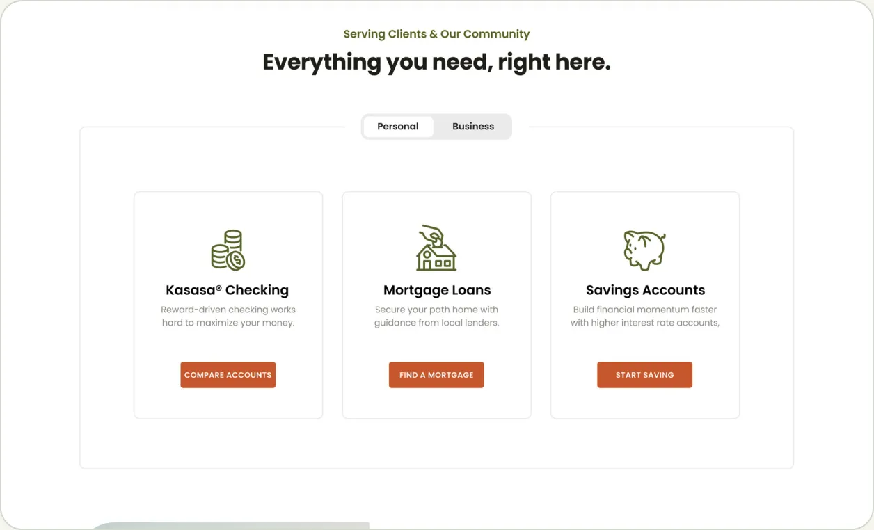
Personal and Business tabs over three product cards.
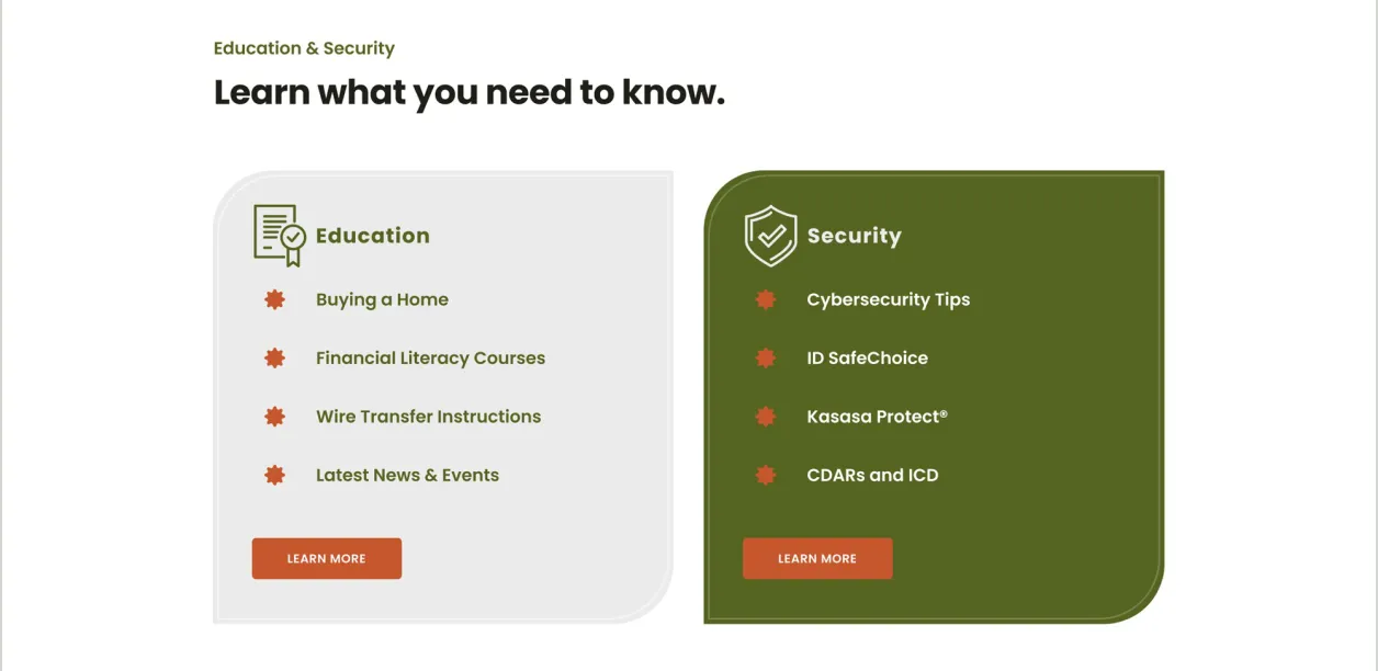
Education and Security get equal weight as paired panels.
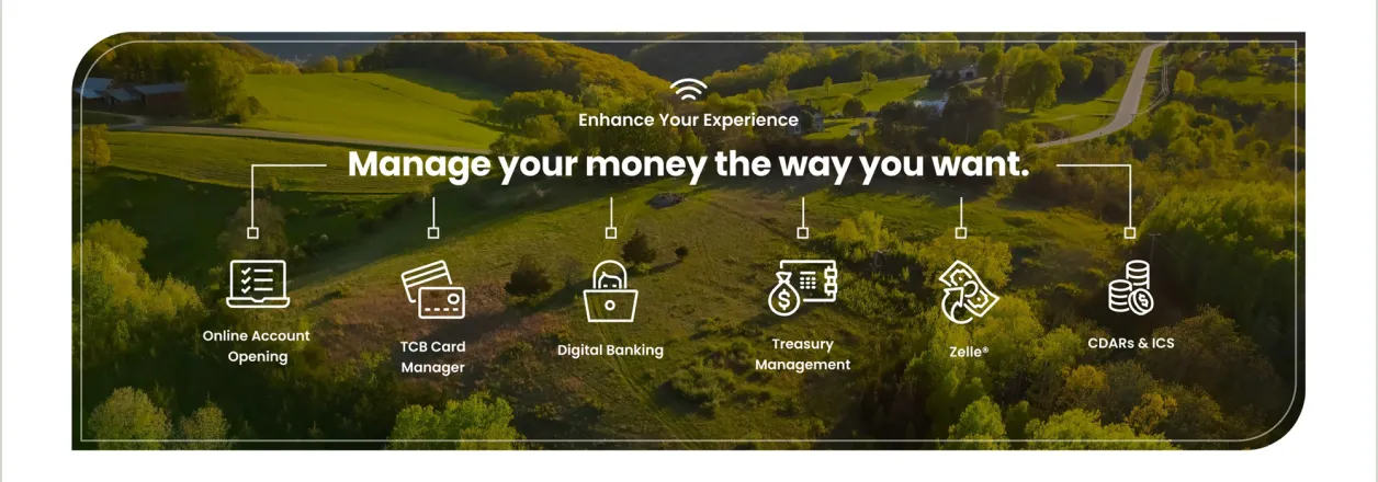
Six digital services gathered in one band.
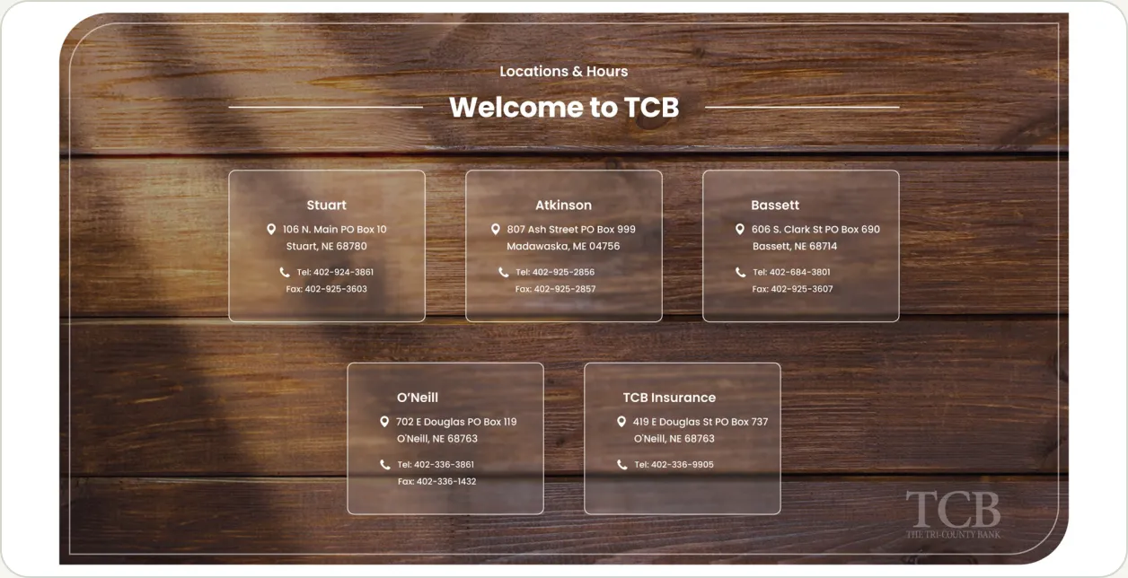
Branch locations on a wood-grain panel.
06 — Templates
Three templates for everything downstream.
List, product and details pages share one header, one sidebar pattern and one set of text styles. The insurance site and the login screen reuse the same parts.
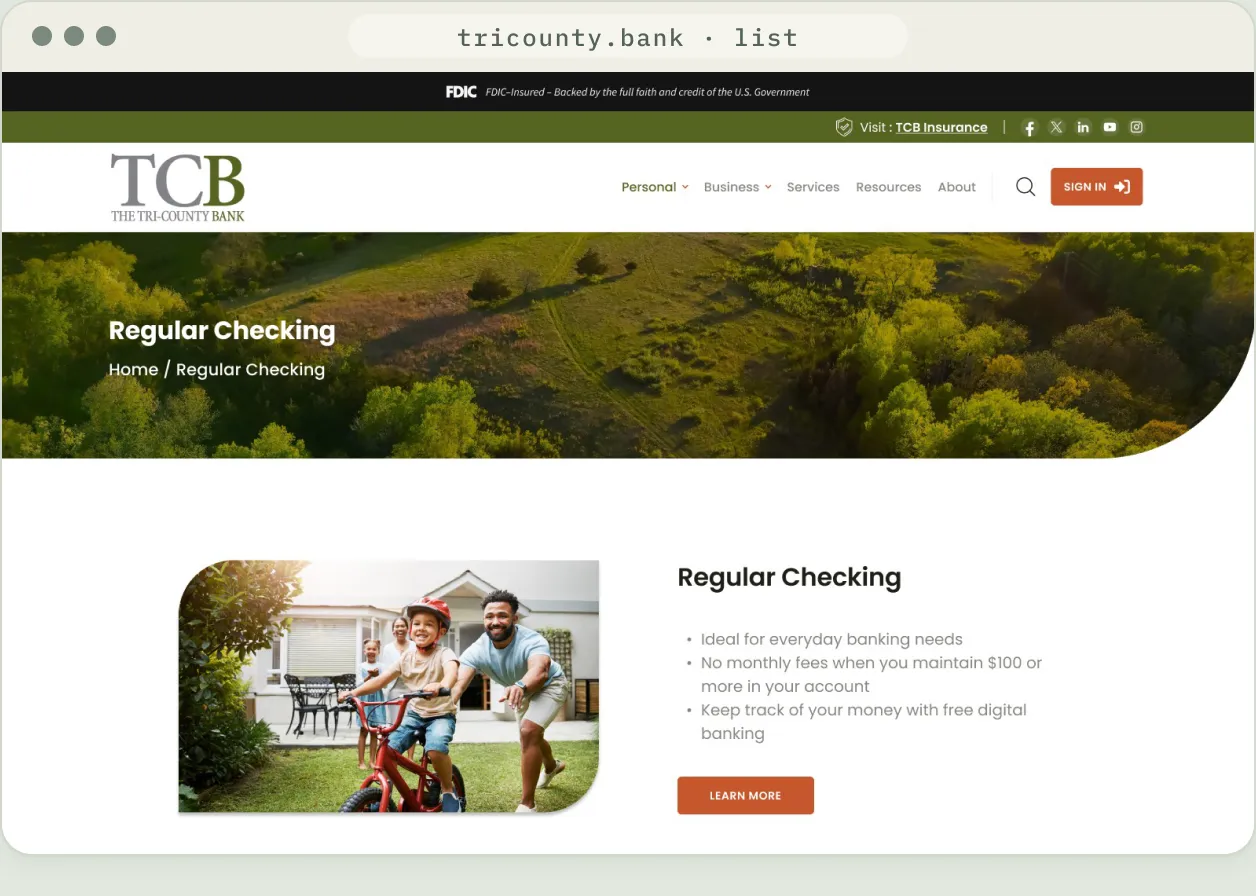
List page: alternating image and copy blocks for a product family.
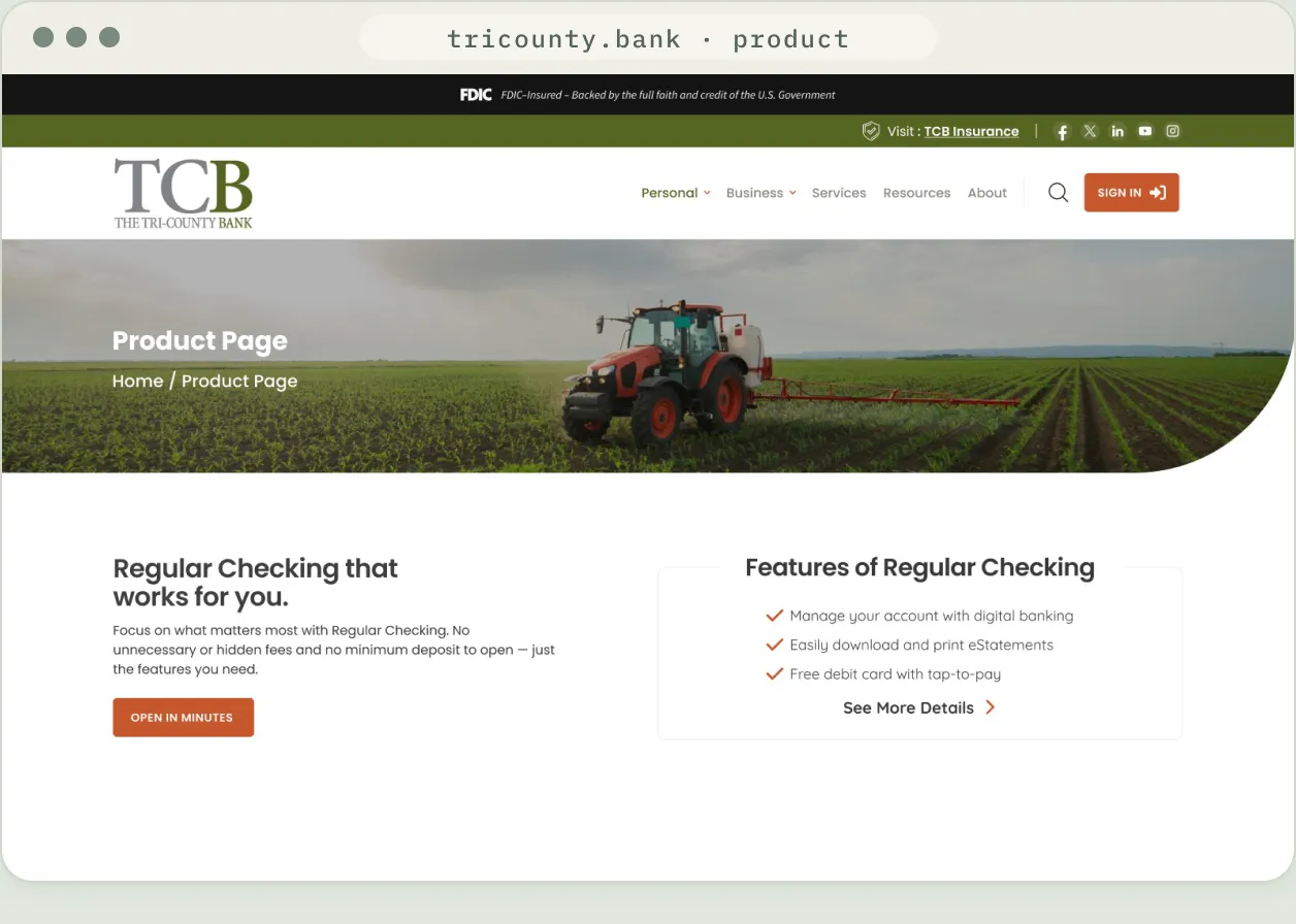
Product page: summary, feature checklist and tabbed details.
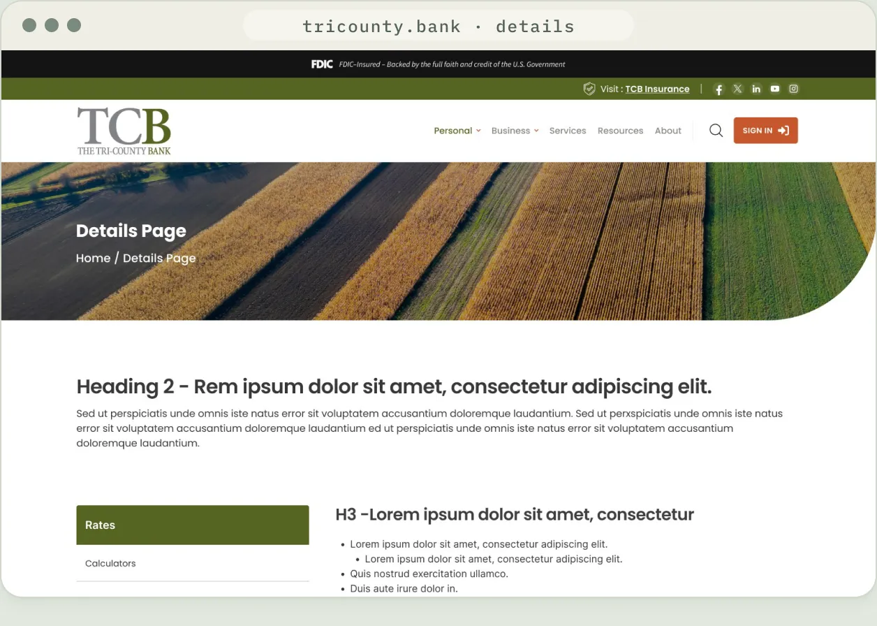
Details page: the long-form template, with every heading and list style defined.
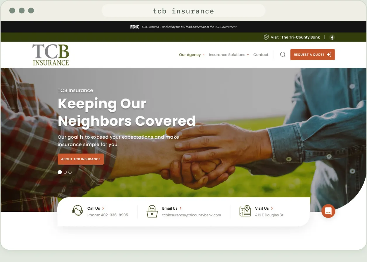
TCB Insurance homepage: the same system with its own navigation and quote request.
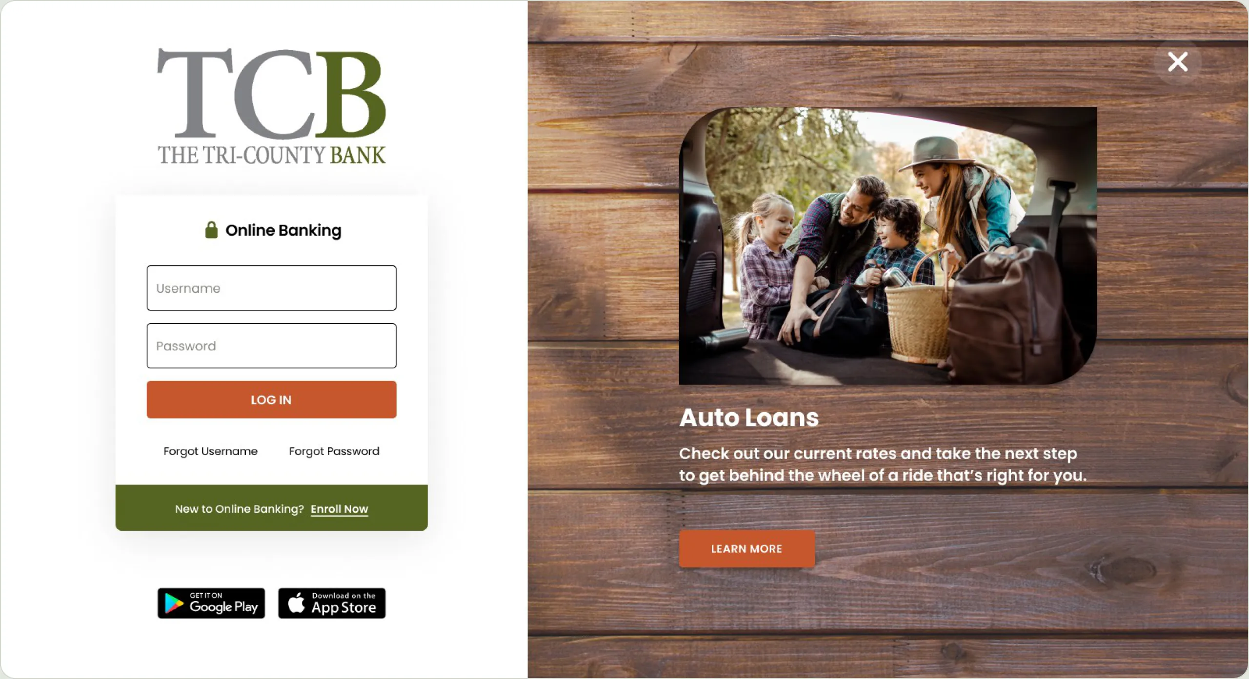
Online banking login: sign-in on the left, a featured offer on the right.
07 — Mobile
The same story on a phone.
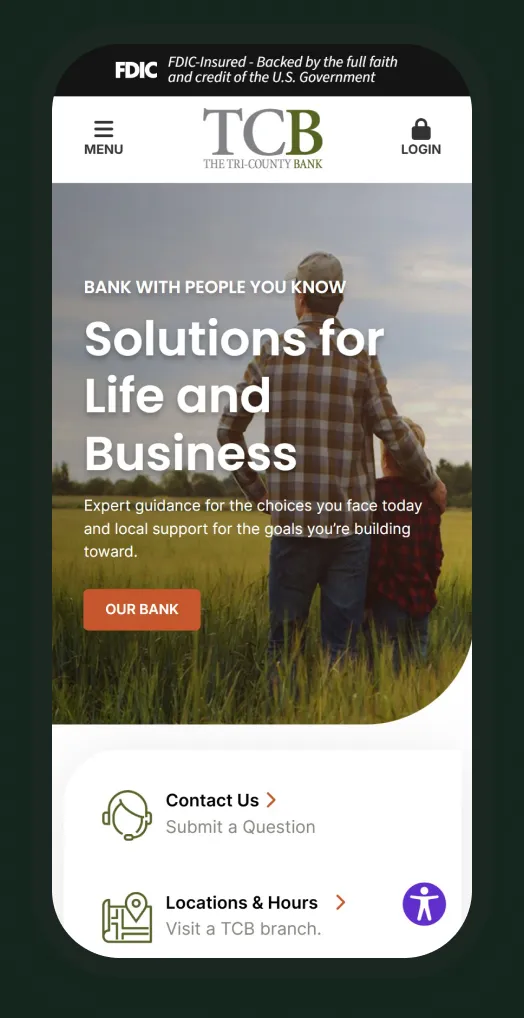
Captured from the live site: hero, quick links and product tabs stack into a single column.
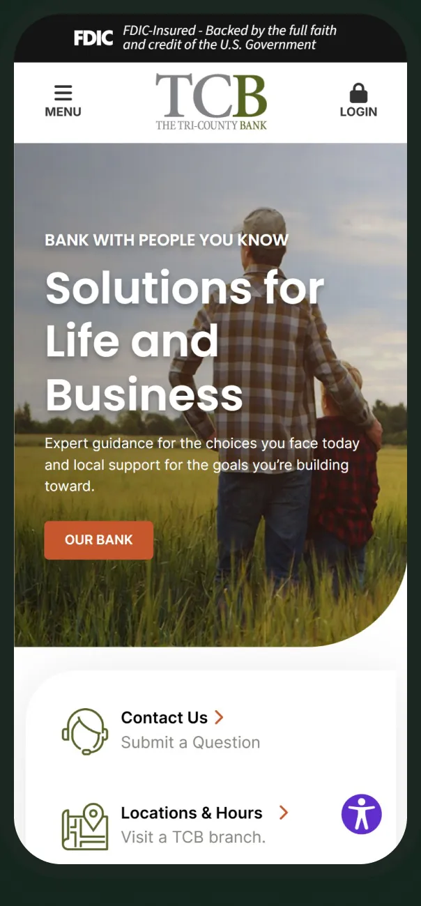
Hero
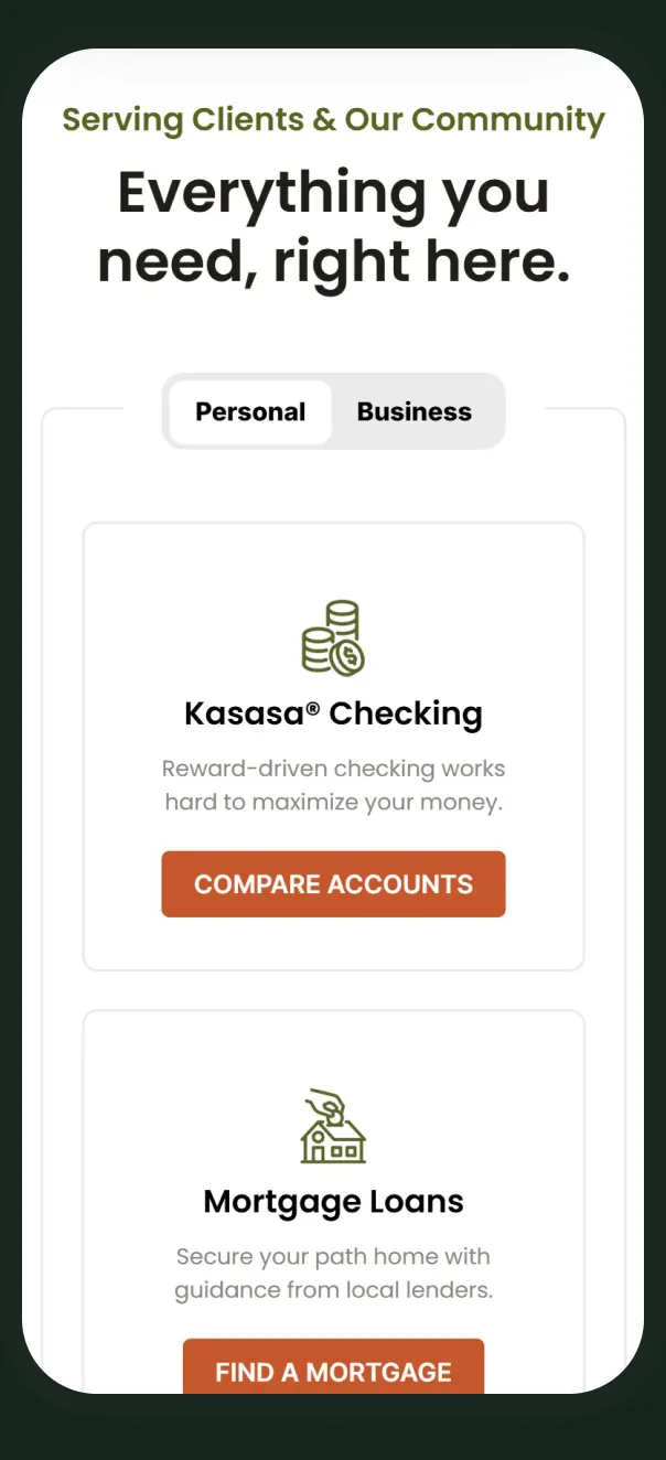
Products
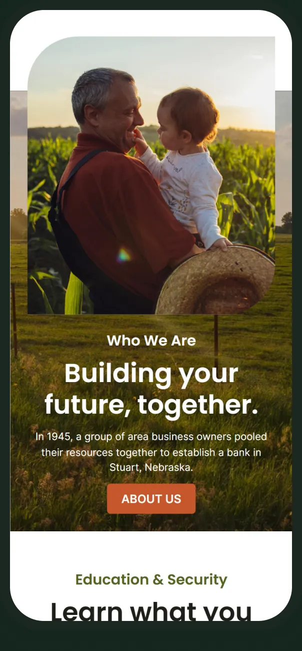
Who we are
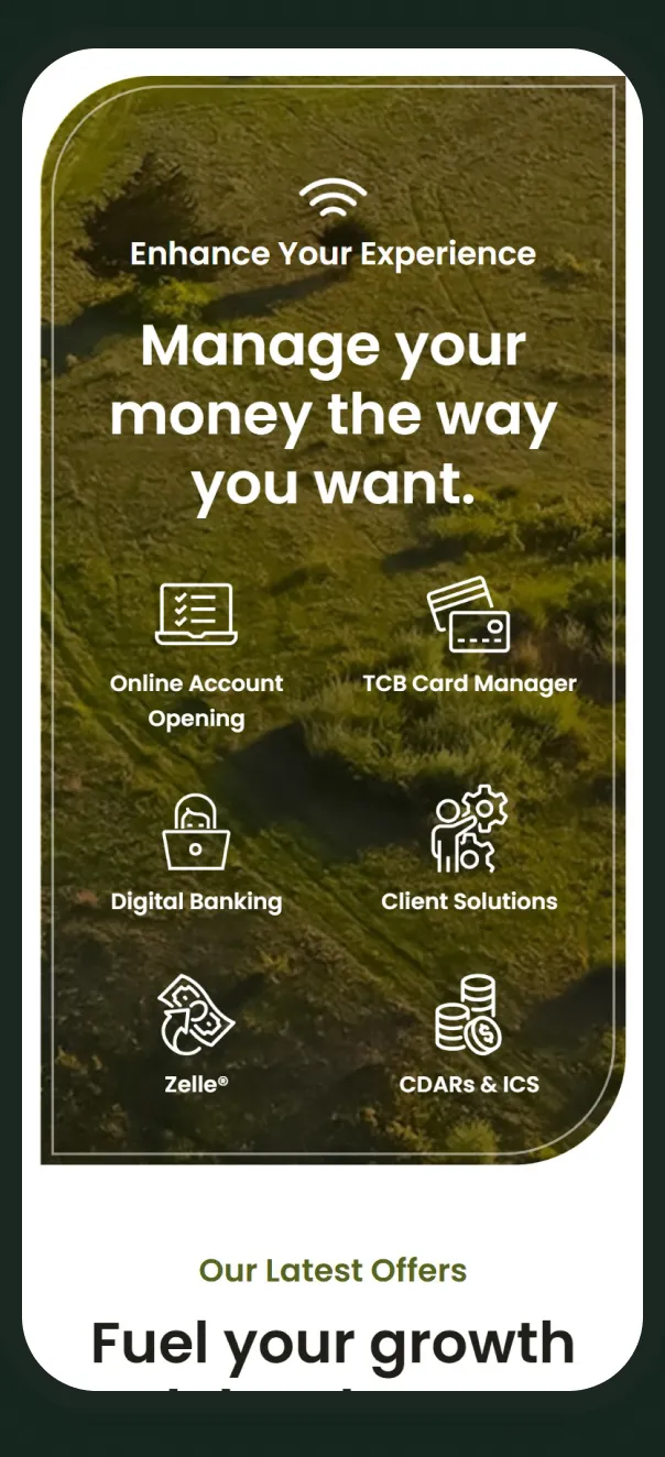
Digital services
08 — Reflection
A community bank’s site doesn’t need to look like a big bank’s. It needs to look like the place it serves, and make everything the bank does easy to find.
Matt Medanich · UI/UX Designer
09 — Outcomes
What shipped.
The redesign is live at tricounty.bank. Counts are taken from the design file.
7
Page templates and key screens designed
Source: TCB design file
9
Goals set in the kickoff brief
Source: TCB design file
2
Sites on one visual system: the bank and TCB Insurance
Source: TCB design file
Next project
Wisdom Heritage Bank
- (01)Portfolio — 2026
- (02)Based in Aledo, TX
- (03)7 years of practice
- (04)Open to new roles
The Tri-County Bank
A website redesign for a Nebraska community bank founded in 1945, built around one promise: bank with people you know.
01 — Overview
Bank with people you know, online.
The Tri-County Bank has served north-central Nebraska since 1945. As a UI/UX designer at Kasasa, I designed its new website: the homepage, page templates, navigation, online banking login and a companion site for TCB Insurance.
I worked from a shared brief with copy, through site map and lo-fi wireframe, to approved designs handed to development. The site is live at tricounty.bank.
Homepage
Nine sections, from a purpose-driven hero to branch locations.
Page templates
List, product and details layouts for the pages downstream.
Navigation
A mega menu that sorts personal products into four groups.
Insurance microsite
A companion homepage for TCB Insurance in the same visual system.
02 — The challenge
More bank than people expected.
01
Show the full range
Surface loans, mortgages, business and digital services without crowding the page.
02
Two clear paths
Make Personal and Business banking obvious from the first screen.
03
Teach to build trust
Give fraud, cybersecurity and financial education a permanent place.
04
Modernize gently
Update the look without losing long-time customers.
03 — Visual language
Olive, rust and open country.
Olive
#566422
Rust
#C6572C
Charcoal
#1F1E17
Stone
#878680
Mist
#EBEBEB
White
#FFFFFF
Poppins Bold · headings
Solutions for Life and Business
Poppins Regular · body
Expert guidance for the choices you face today and local support for the goals you’re building toward.
04 — Process
From kickoff notes to launch.
01
Collab
Goals, audience and brand notes
02
Site map
Every page typed and placed
03
Wireframe
Lo-fi layout and section order
04
Design
Hi-fi pages through approval
05
Launch
Handed to development, now live
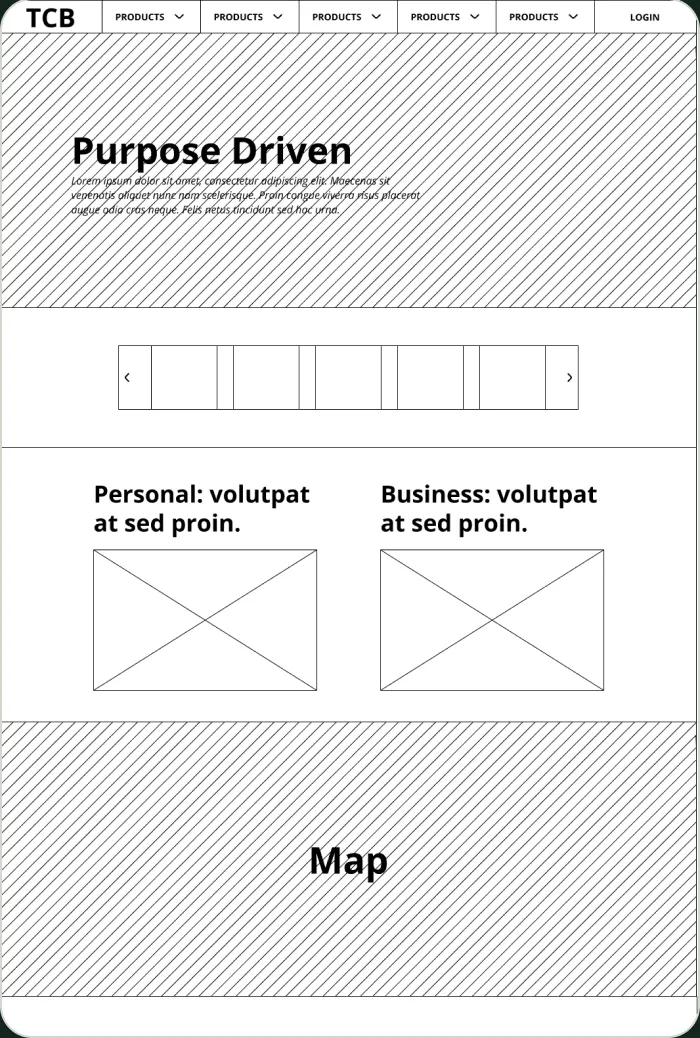
Lo-fi wireframe: section order and groupings agreed before any visual design.
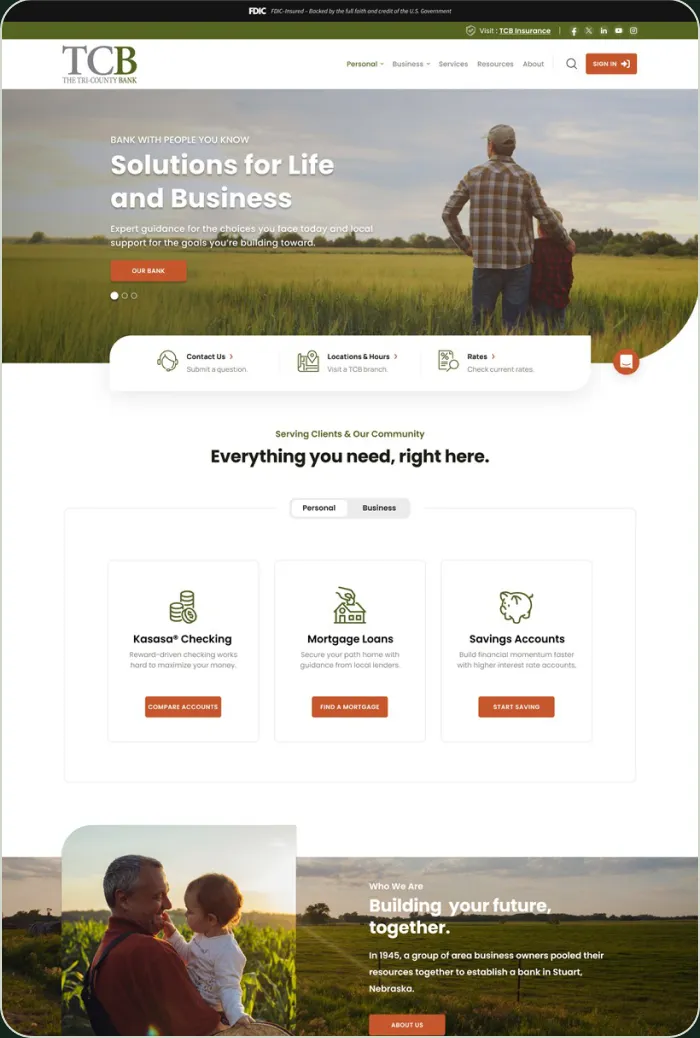
Approved homepage: the same order, with the map idea resolved as a locations panel.
Site map for the TCB Insurance microsite, with a key for each page type.
05 — Homepage
A homepage that leads with purpose, not promotions.
01
Utility strip
FDIC notice, insurance link and sign-in stay visible above the header.
02
Purpose-driven hero
One message and one action over wide rural photography.
03
Quick access
Contact, locations and rates sit directly under the hero.
04
One accent for action
Rust is used only for buttons and sign-in.
Personal and Business tabs over three product cards.
Education and Security get equal weight as paired panels.
06 — Templates
Three templates for everything downstream.
List page: alternating image and copy blocks for a product family.
Product page: summary, feature checklist and tabbed details.
TCB Insurance homepage: the same system with its own navigation.
Online banking login: sign-in on the left, a featured offer on the right.
07 — Mobile
The same story on a phone.
Hero
Products
Who we are
Digital services
08 — Reflection
A community bank’s site doesn’t need to look like a big bank’s. It needs to look like the place it serves, and make everything the bank does easy to find.
Matt Medanich · UI/UX Designer
09 — Outcomes
What shipped.
The redesign is live at tricounty.bank. Counts are taken from the design file.
7
Page templates and key screens designed
Source: TCB design file
9
Goals set in the kickoff brief
Source: TCB design file
2
Sites on one visual system
Source: TCB design file