- (01)Portfolio — 2026
- (02)Based in Aledo, TX
- (03)7 years of practice
- (04)Open to new roles
Wisdom Heritage Bank
A new website for an Oklahoma community bank founded in 1901, launched alongside its new name.
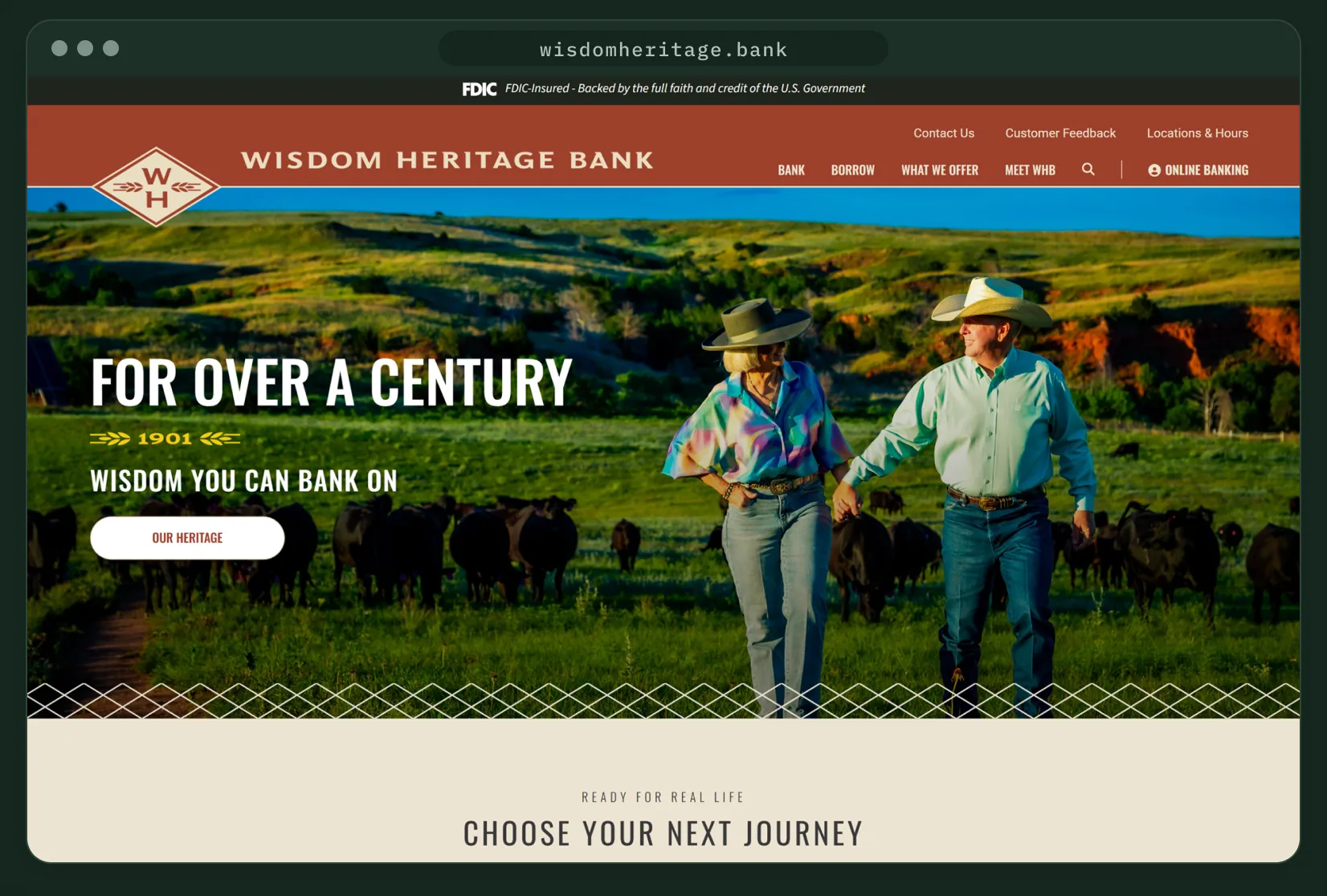
Live at wisdomheritage.bank
01 — Overview
New name, same bank, online.
Wisdom Heritage Bank was founded in 1901 as Alva State Bank & Trust. After merging with a sister bank in 2024, it chose one name for all six branches. As a UI/UX designer at Kasasa, I designed the website that carries that name: homepage, page templates, navigation and online banking login.
I worked from a kickoff brief and the new brand kit, through a lo-fi wireframe, to approved designs handed to development. The site is live at wisdomheritage.bank.
Homepage
Six sections in the order the brief ranked them, from heritage hero to rates.
Page templates
List, product and details layouts for the pages downstream.
Navigation
A four-column mega menu under a header that carries the diamond mark.
Online banking
A login overlay that pairs sign-in with a note about the name change.
02 — The challenge
A new name customers could trust.
The brief paired a rebrand with a growth goal: reach younger customers without losing the ones who built the bank.
01
One bank, one name
Make six branches from two merged banks read as one institution.
02
Younger, not different
Appeal to a younger audience while staying familiar to a customer base mostly over 50.
03
Lead with growth products
Put rewards checking, the tiered money market, loans and rates up front.
04
Serious and fun
Rank authentic first, clean and modern second, with room for color and play.
03 — Visual language
Brick, evergreen and diamonds.
The bank’s new identity supplied the palette, the diamond mark and its patterns. My job was turning that kit into web components, with rounded corners to offset the diamonds.
Brick
#9F412C
Header, buttons, links and the closing call to action
Evergreen
#3B4133
Headings and the digital banking panel
Denim Blue
#4B5D5C
Footer, login panel and diamond accents
Harvest Gold
#AA832D
Diamond accents and small highlights
Ledger Black
#21261E
FDIC bar and footer tray
Cream
#E9DEC6
Page background and cards
Oswald Medium · headings
Choose your next journey
Roboto Regular · body, Oswald Medium · buttons
Finally, a free checking account that pays high interest when you meet monthly qualifications.
Start saving
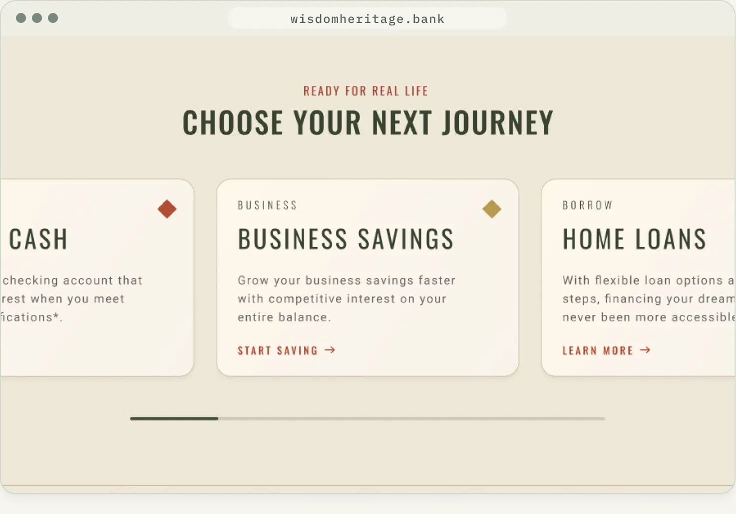
Product cards are tagged Personal, Business or Borrow, each with its own diamond color.
04 — Process
From kickoff brief to launch.
The brief, wireframe and each design round live in one working file, tracked with a status tag.
01
Collab
Goals, audience and brand notes
02
Site map
New pages for the name change and team
03
Wireframe
Lo-fi layout and section order
04
Design
Hi-fi pages through approval
05
Launch
Handed to development, now live
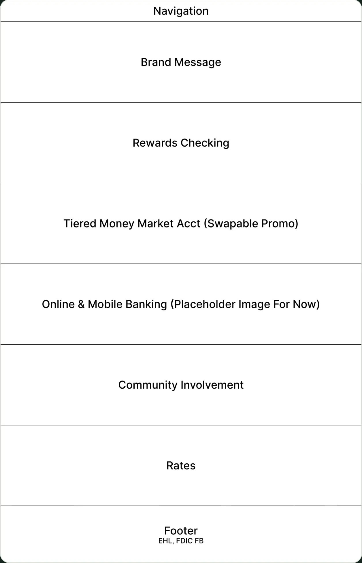
Lo-fi wireframe: the brief’s top six, stacked in priority order.
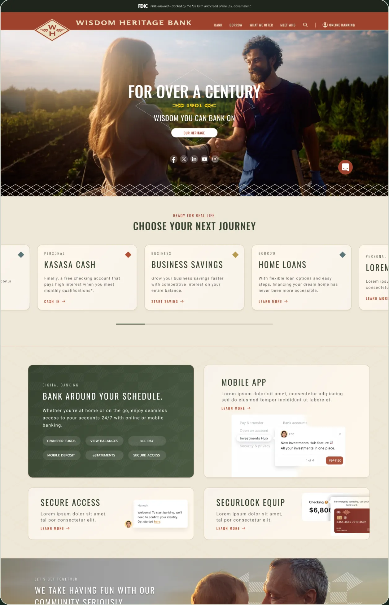
Approved homepage: the same priorities, with the money market promo folded into the rates panel.
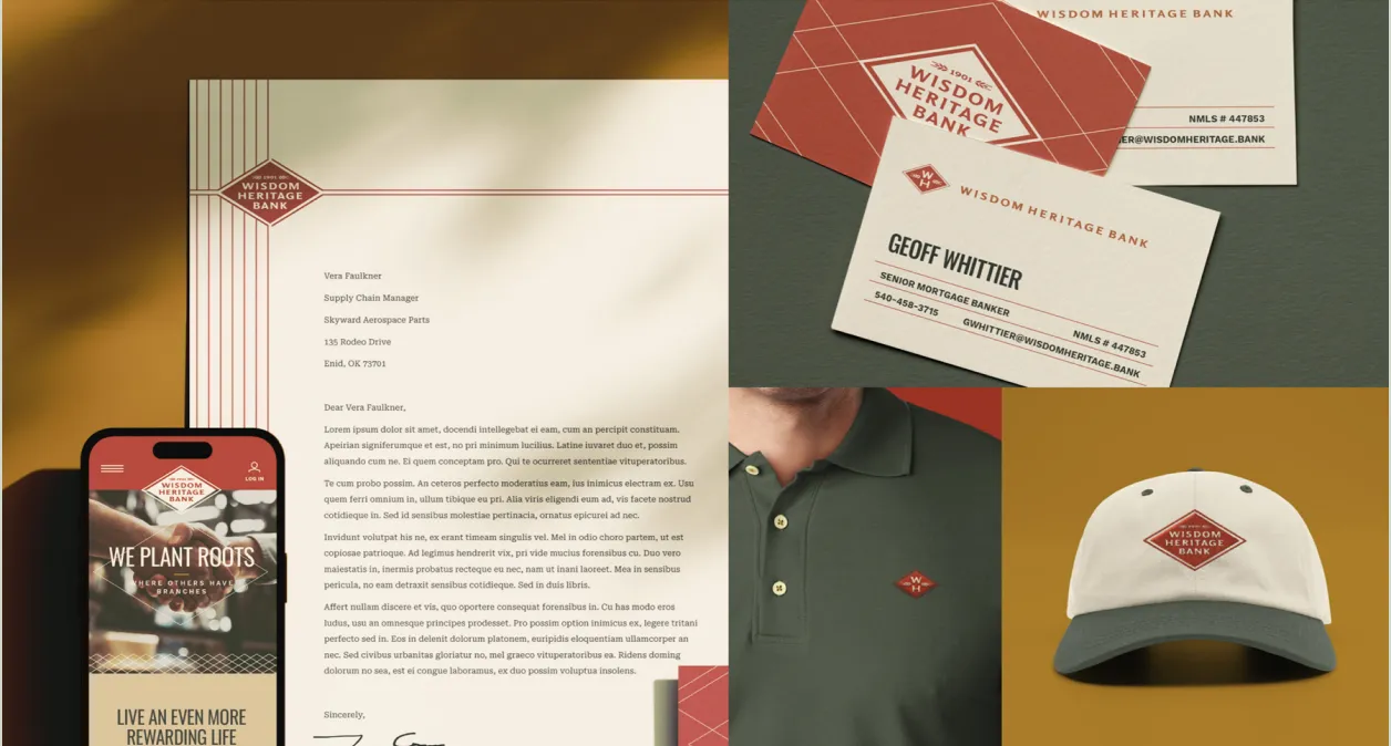
Brand board from the kickoff brief: the new identity the site had to carry.
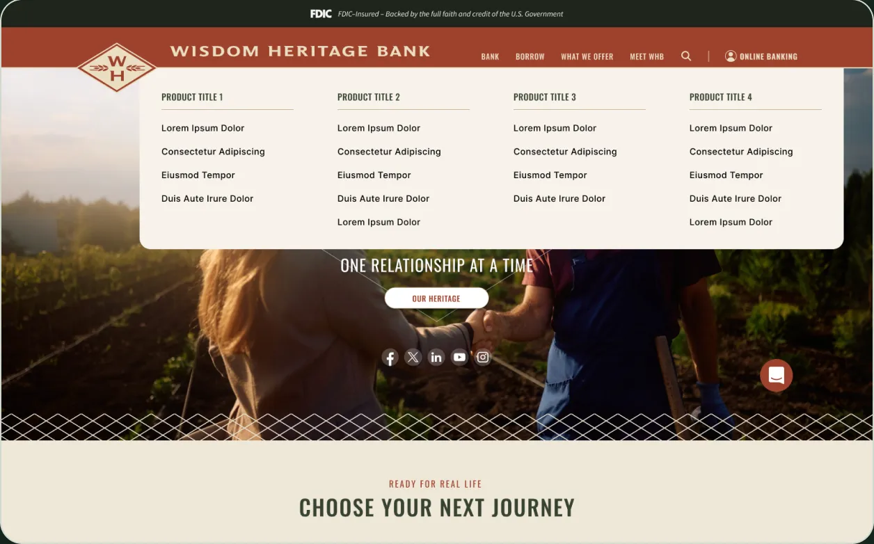
Mega menu: four product columns in a rounded panel under the header.
05 — Homepage
A homepage built from the brief’s top six.
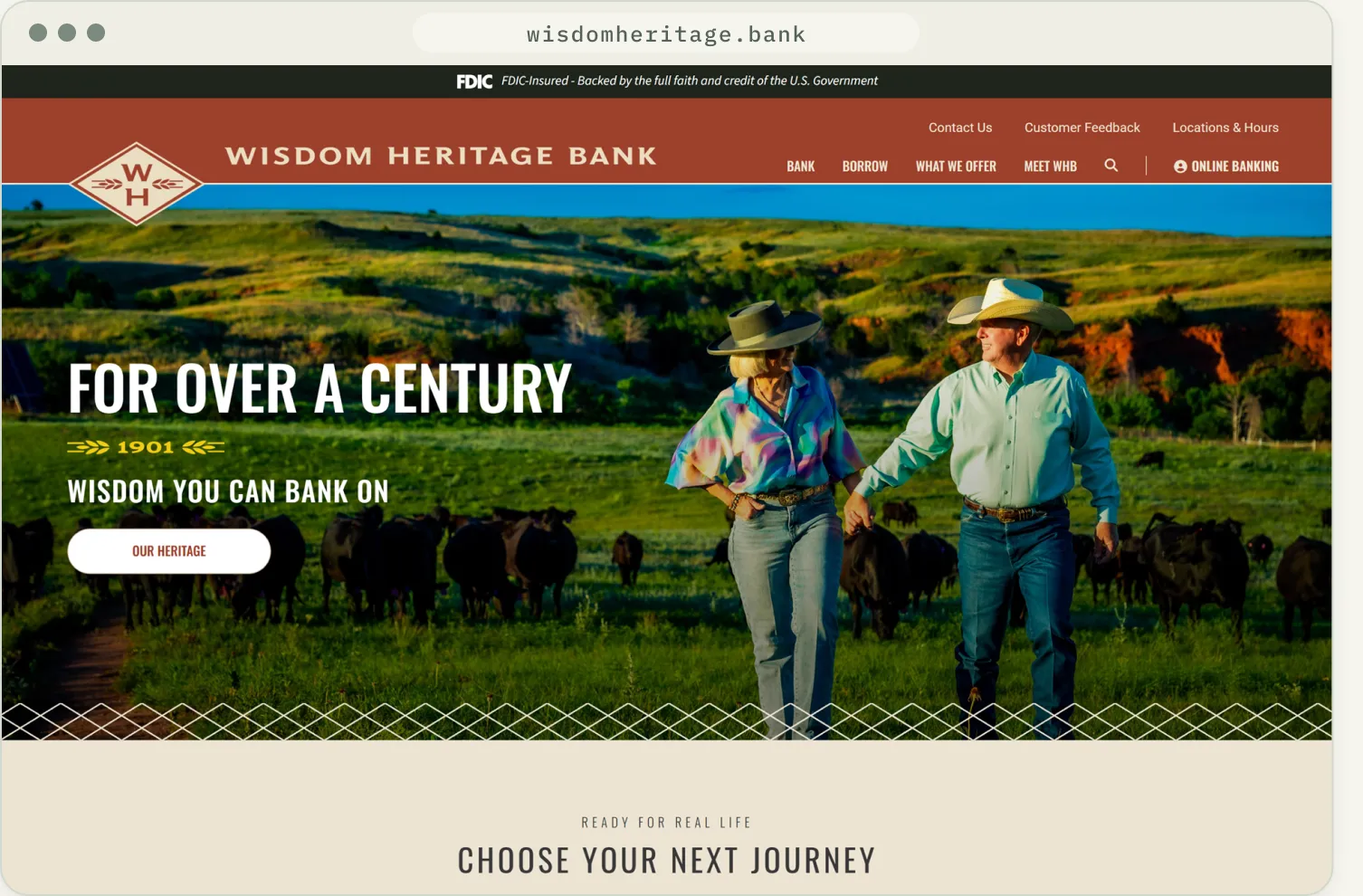
01
Diamond in the header
The monogram breaks the header edge; the wordmark sits beside it.
02
Heritage hero
For over a century, 1901, and one action over farm photography.
03
Journey cards
A swappable carousel of products tagged by audience.
04
Rounded on purpose
Pill buttons and soft cards offset the diamond lattice.
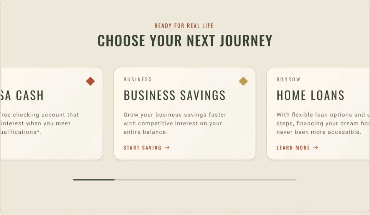
Choose your next journey: product cards with color-coded diamonds.
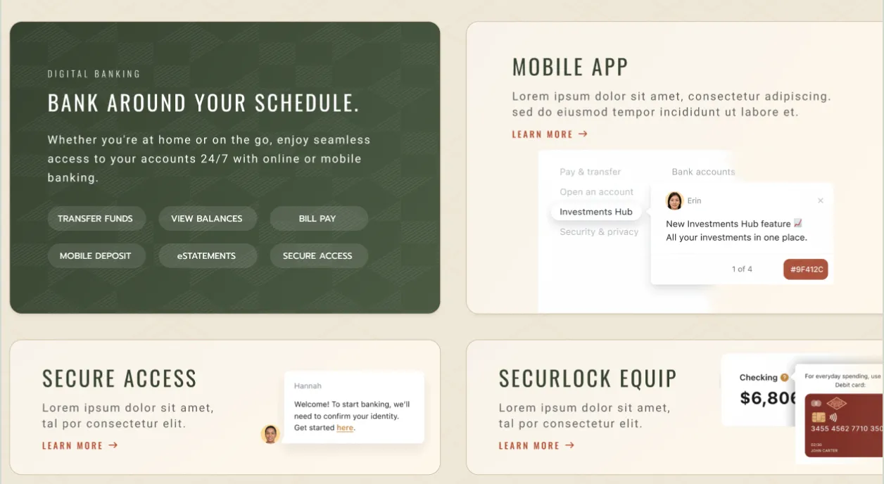
Digital banking: six tasks as pills beside app and card features.
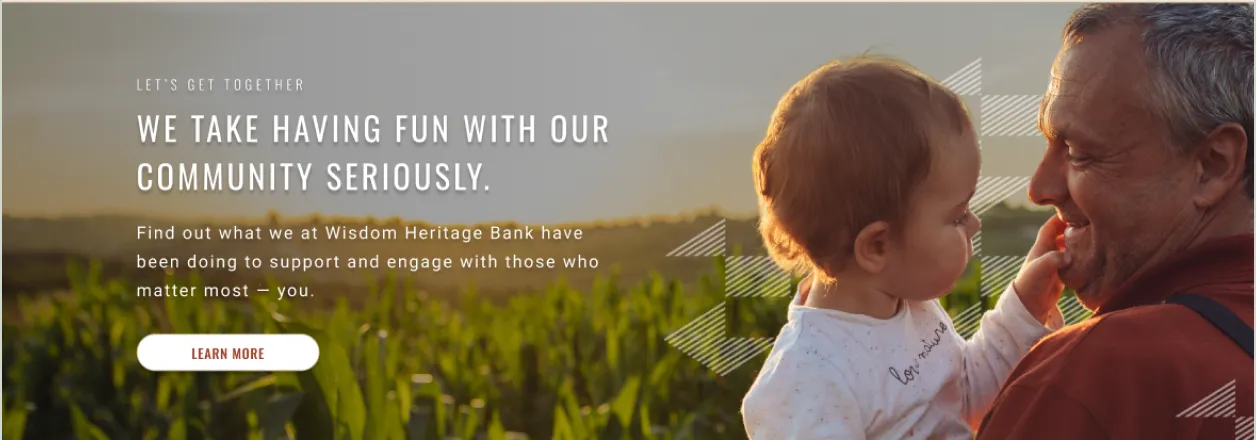
Community: a photo band with the diamond pattern as texture.
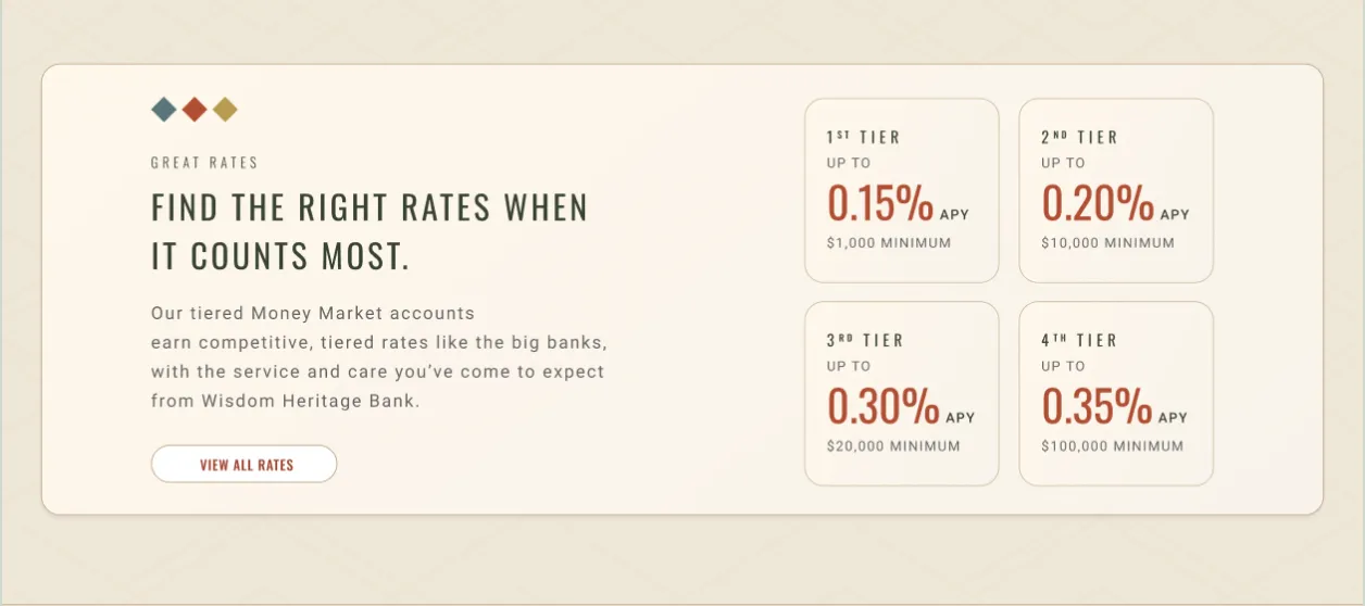
Rates: four money market tiers set as large numerals.
06 — Templates
Three templates for everything downstream.
List, product and details pages share one header, one banner pattern and one closing call to action. A header study and the login overlay round out the set.
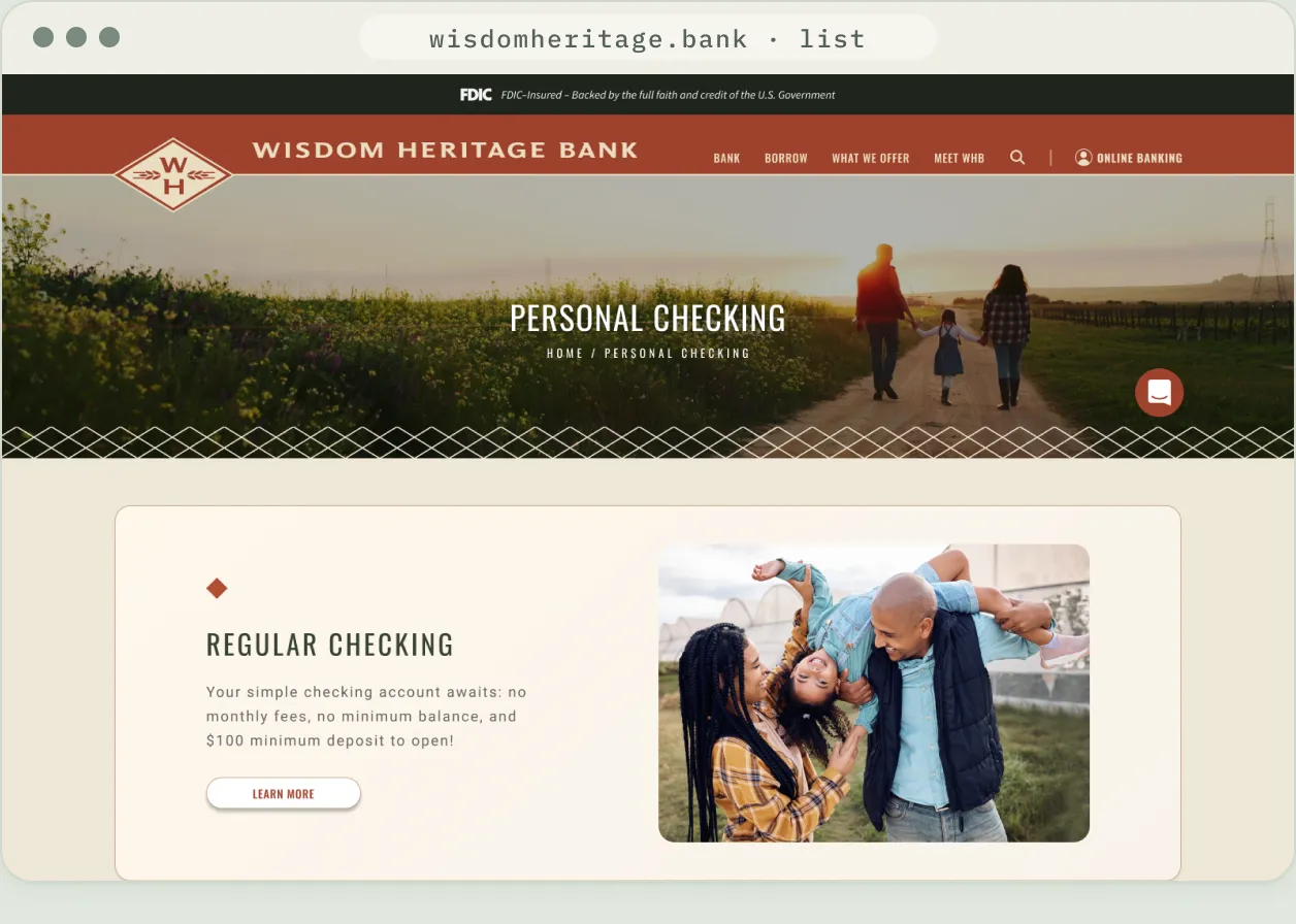
List page: alternating image and copy blocks for a product family.
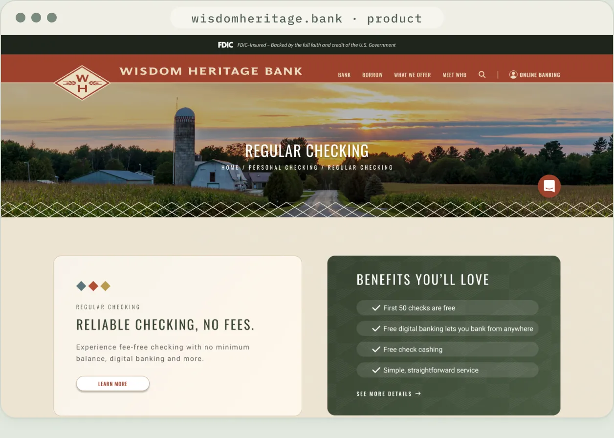
Product page: summary, feature checklist and tabbed details.
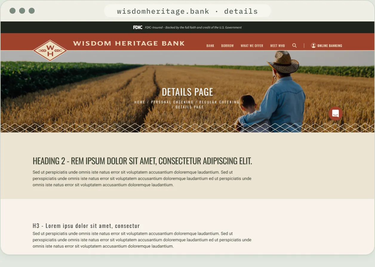
Details page: the long-form template, with every heading and list style defined.
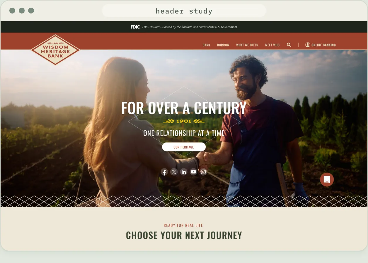
Header study: the full diamond lockup, tested before the monogram and wordmark shipped.
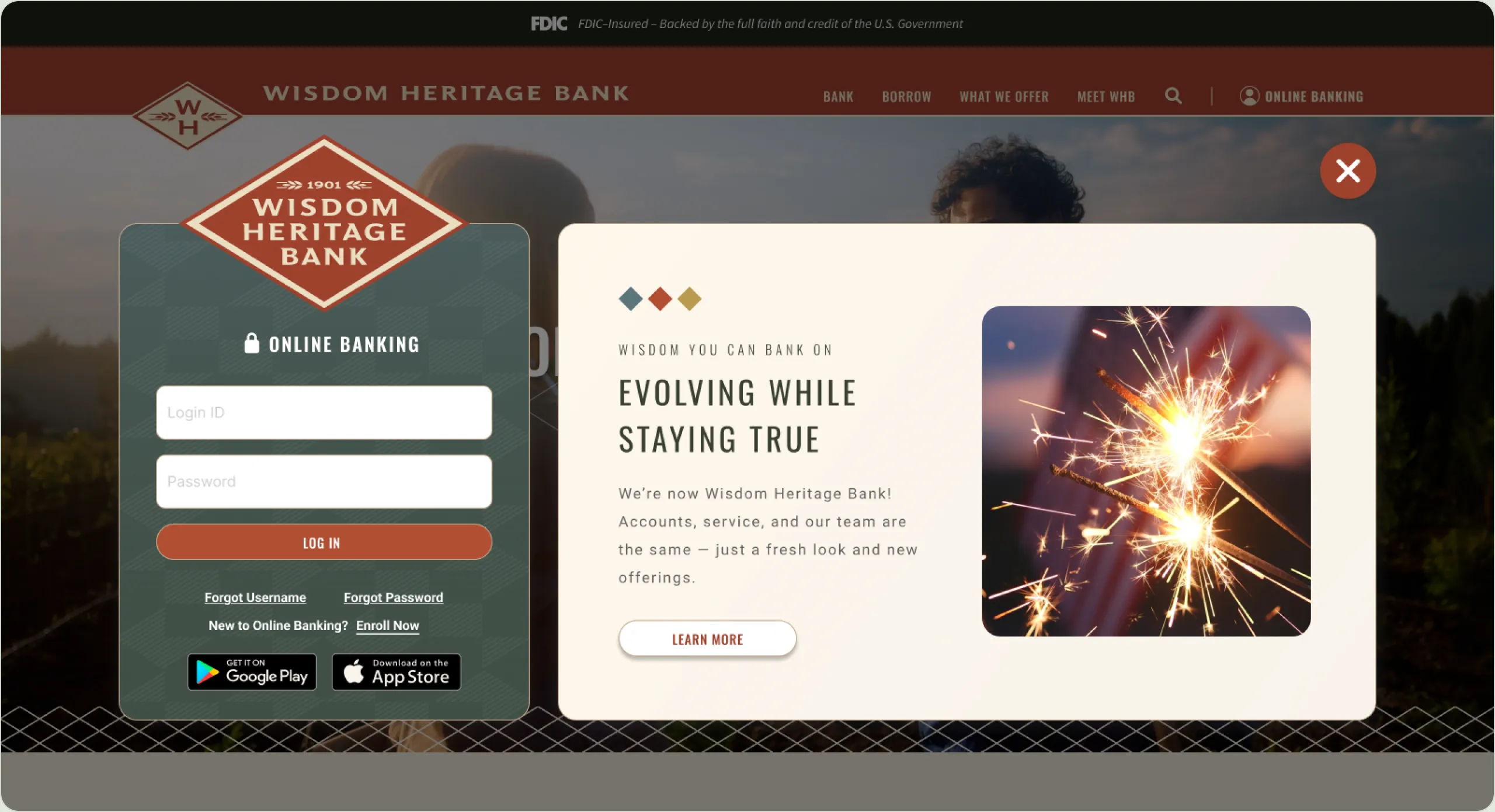
Online banking login: sign-in on the left, the name-change message on the right.
07 — Mobile
The same story on a phone.
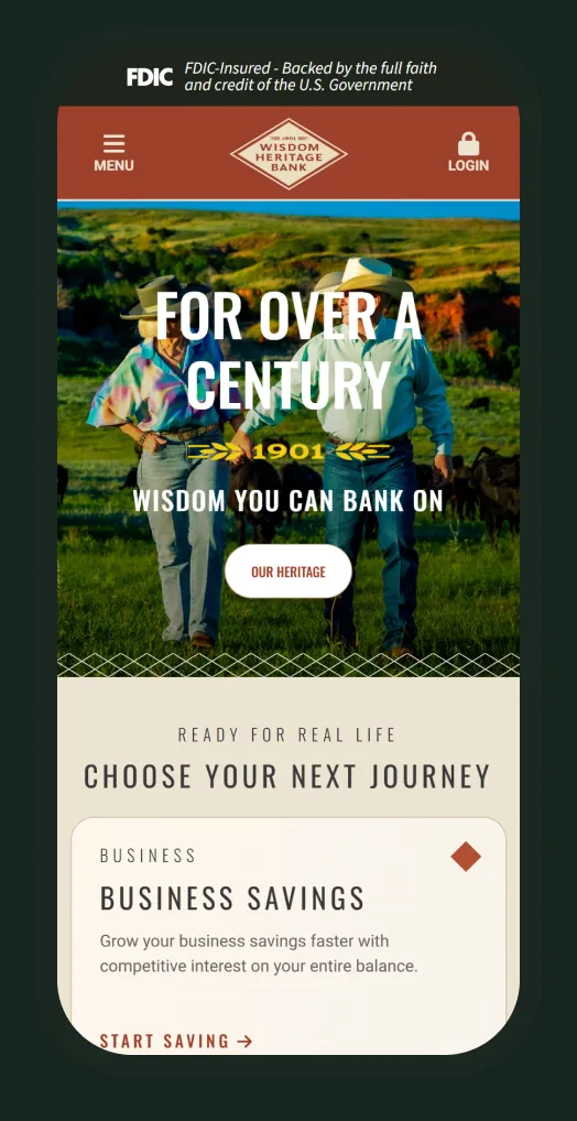
Captured from the live site: hero, product cards and digital banking stack into a single column.
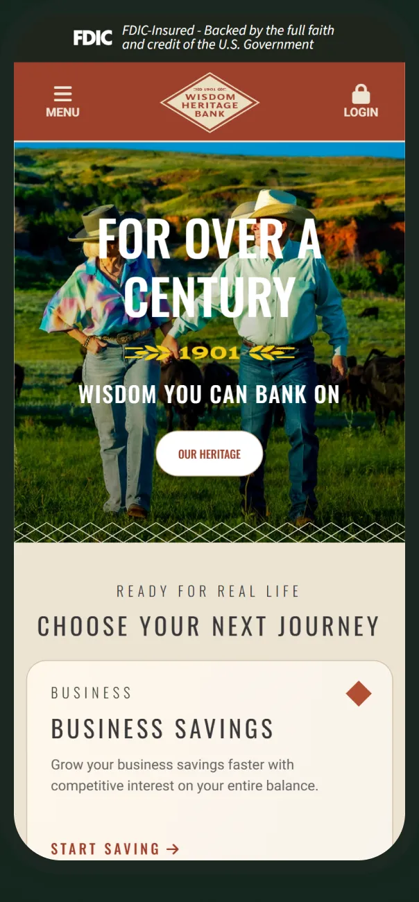
Hero
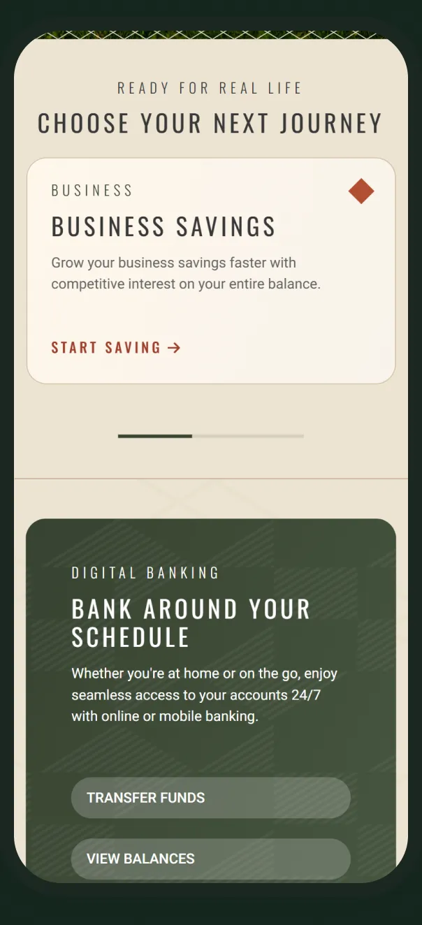
Product cards
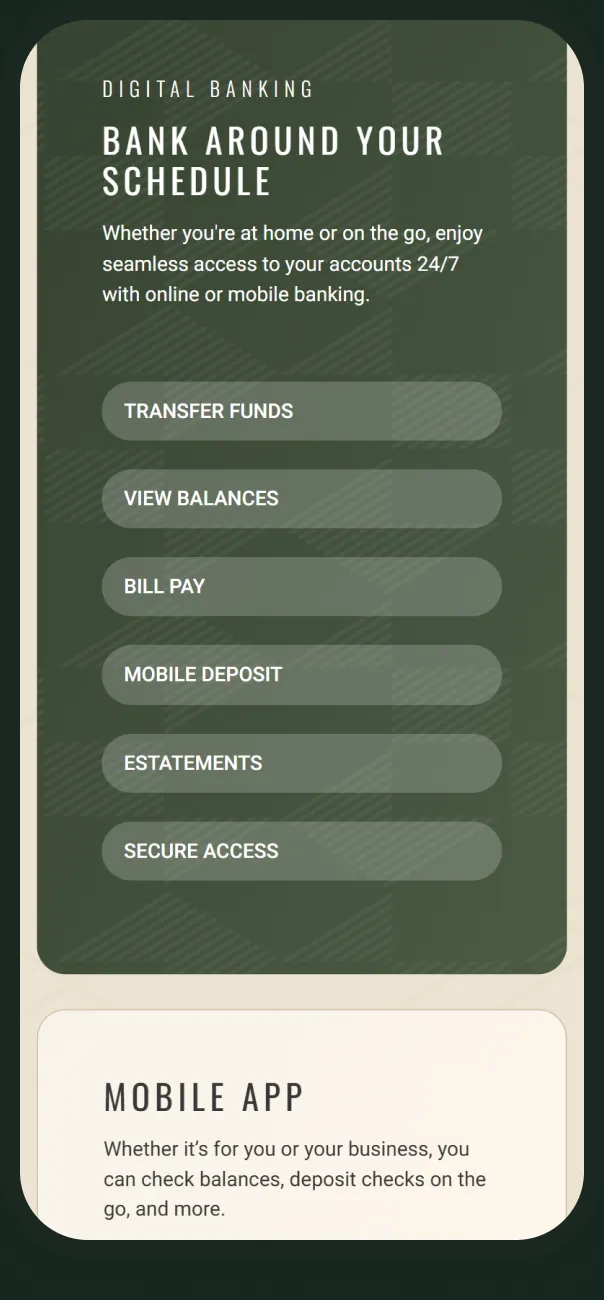
Digital banking
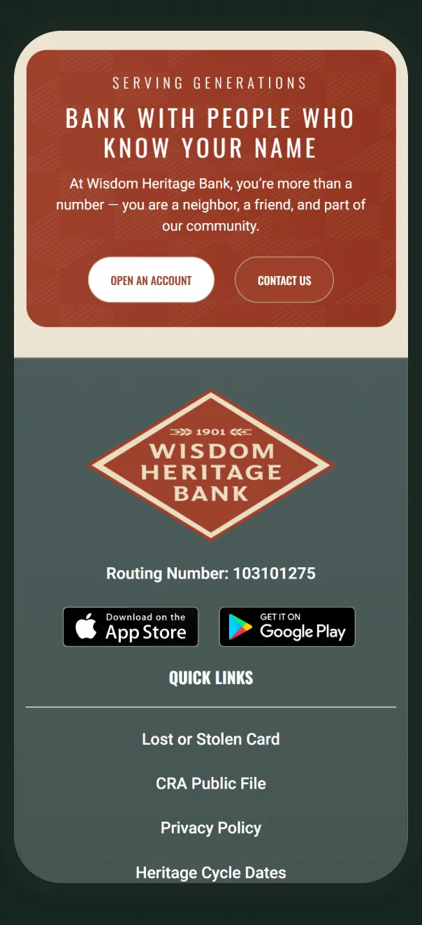
Closing call
08 — Reflection
A new name asks customers to trust something unfamiliar. The site had to make it feel like the bank they already knew: the same people and the same fields, with a clearer front door.
Matt Medanich · UI/UX Designer
09 — Outcomes
What shipped.
The site is live at wisdomheritage.bank under the new name. Counts are taken from the design file and brief.
7
Page templates and key screens designed
Source: WHB design file
6
Kickoff priorities, all on the live homepage
Source: kickoff brief
1
Website for six branches under one name
Source: wisdomheritage.bank
Next project
NorState FCU
- (01)Portfolio — 2026
- (02)Based in Aledo, TX
- (03)7 years of practice
- (04)Open to new roles
Wisdom Heritage Bank
A new website for an Oklahoma community bank founded in 1901, launched alongside its new name.
01 — Overview
New name, same bank, online.
Wisdom Heritage Bank was founded in 1901 as Alva State Bank & Trust. After merging with a sister bank in 2024, it chose one name for all six branches. As a UI/UX designer at Kasasa, I designed the website that carries that name: homepage, page templates, navigation and online banking login.
I worked from a kickoff brief and the new brand kit, through a lo-fi wireframe, to approved designs handed to development. The site is live at wisdomheritage.bank.
Homepage
Six sections in the order the brief ranked them, from heritage hero to rates.
Page templates
List, product and details layouts for the pages downstream.
Navigation
A four-column mega menu under a header that carries the diamond mark.
Online banking
A login overlay that pairs sign-in with a note about the name change.
02 — The challenge
A new name customers could trust.
01
One bank, one name
Make six branches from two merged banks read as one institution.
02
Younger, not different
Appeal to a younger audience while staying familiar to a customer base mostly over 50.
03
Lead with growth products
Put rewards checking, the tiered money market, loans and rates up front.
04
Serious and fun
Rank authentic first, clean and modern second, with room for color and play.
03 — Visual language
Brick, evergreen and diamonds.
Brick
#9F412C
Evergreen
#3B4133
Denim Blue
#4B5D5C
Harvest Gold
#AA832D
Ledger Black
#21261E
Cream
#E9DEC6
Oswald Medium · headings
Choose your next journey
Roboto Regular · body
Finally, a free checking account that pays high interest when you meet monthly qualifications.
04 — Process
From kickoff brief to launch.
01
Collab
Goals, audience and brand notes
02
Site map
New pages for the name change and team
03
Wireframe
Lo-fi layout and section order
04
Design
Hi-fi pages through approval
05
Launch
Handed to development, now live
Lo-fi wireframe: the brief’s top six, stacked in priority order.
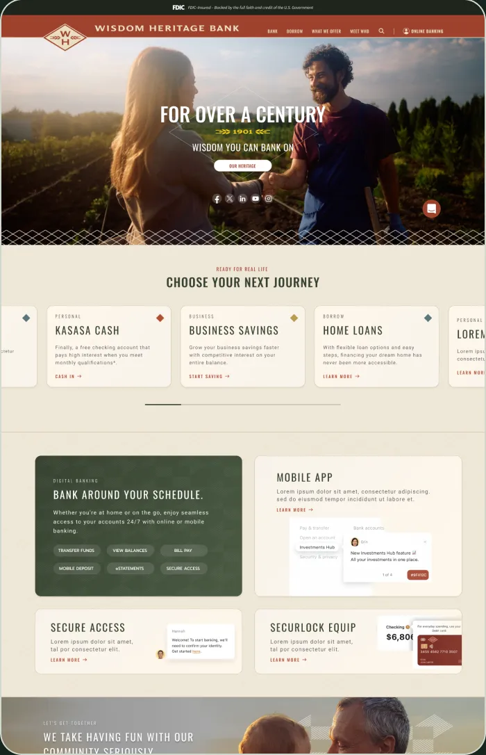
Approved homepage: the same priorities, with the money market promo folded into the rates panel.
Brand board from the kickoff brief: the new identity the site had to carry.
05 — Homepage
A homepage built from the brief’s top six.
01
Diamond in the header
The monogram breaks the header edge; the wordmark sits beside it.
02
Heritage hero
For over a century, 1901, and one action over farm photography.
03
Journey cards
A swappable carousel of products tagged by audience.
04
Rounded on purpose
Pill buttons and soft cards offset the diamond lattice.
Choose your next journey: product cards with color-coded diamonds.
Digital banking: six tasks as pills beside app and card features.
06 — Templates
Three templates for everything downstream.
List page: alternating image and copy blocks for a product family.
Product page: summary, feature checklist and tabbed details.
Header study: the full diamond lockup, tested before the monogram and wordmark shipped.
Online banking login: sign-in on the left, the name-change message on the right.
07 — Mobile
The same story on a phone.
Hero
Product cards
Digital banking
Closing call
08 — Reflection
A new name asks customers to trust something unfamiliar. The site had to make it feel like the bank they already knew: the same people and the same fields, with a clearer front door.
Matt Medanich · UI/UX Designer
09 — Outcomes
What shipped.
The site is live at wisdomheritage.bank under the new name. Counts are taken from the design file and brief.
7
Page templates and key screens designed
Source: WHB design file
6
Kickoff priorities on the live homepage
Source: kickoff brief
1
Website for six branches under one name
Source: wisdomheritage.bank