NorState Federal Credit UnionWebCredit unionFinancial2026
NorState FCU
A website redesign for a Northern Maine credit union, serving members since 1941, that should feel like a trusted local partner online.
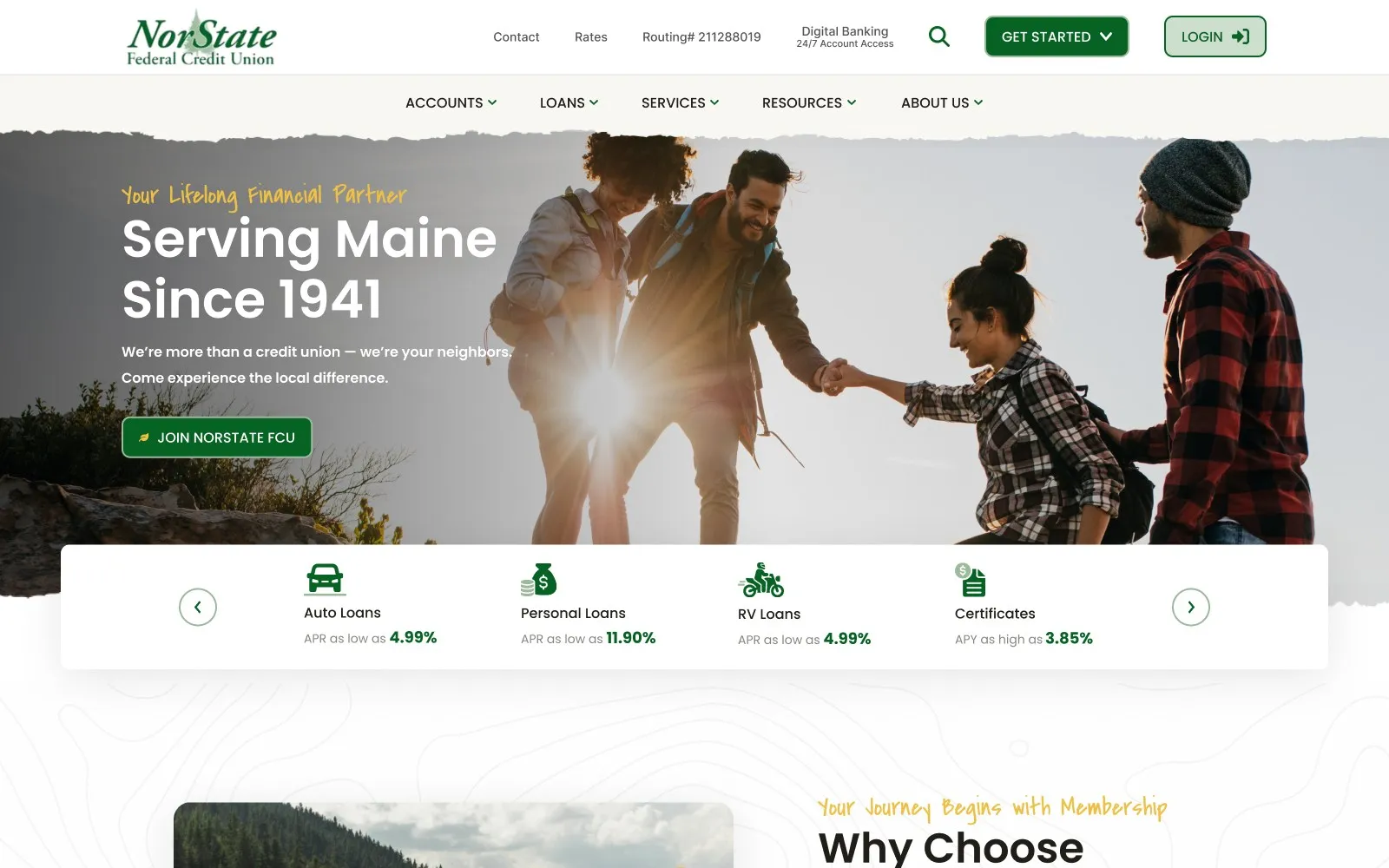
01 Summary
Built for the people who live here, work here, and plan to stay here.
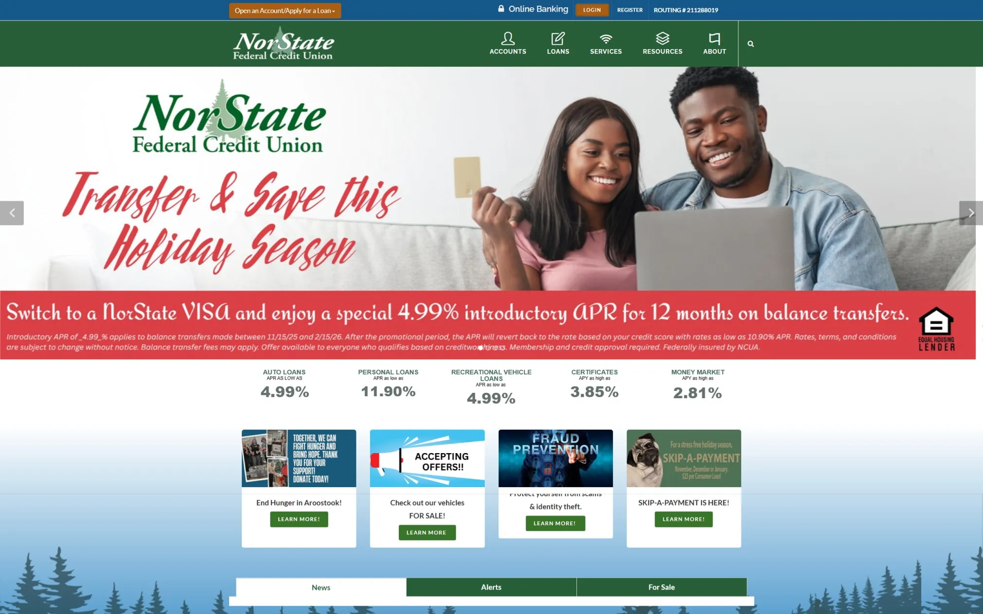
NorState is a relationship-driven credit union in Northern Maine. Members got warm, personal service in the branch, but the website felt dated and boxy, and it hid the story that makes a credit union different from a bank.
The goal, in the brief’s words: “Tell NorState’s story!”
Project goals (from the brief)
- Make products, benefits and next steps simple to understand
- Build trust with clear messaging and a polished, accessible design
- Make joining, logging in, applying and finding rates effortless
- Design navigation that works for every age and comfort level
- Support digital-first users and in-branch members alike
02 Role
Designer
I designed the new site from brief to final handoff.
- Research and competitor review
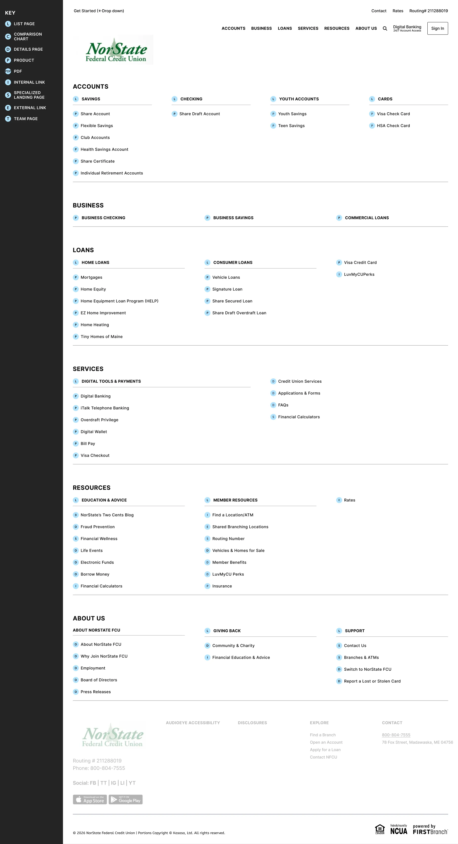
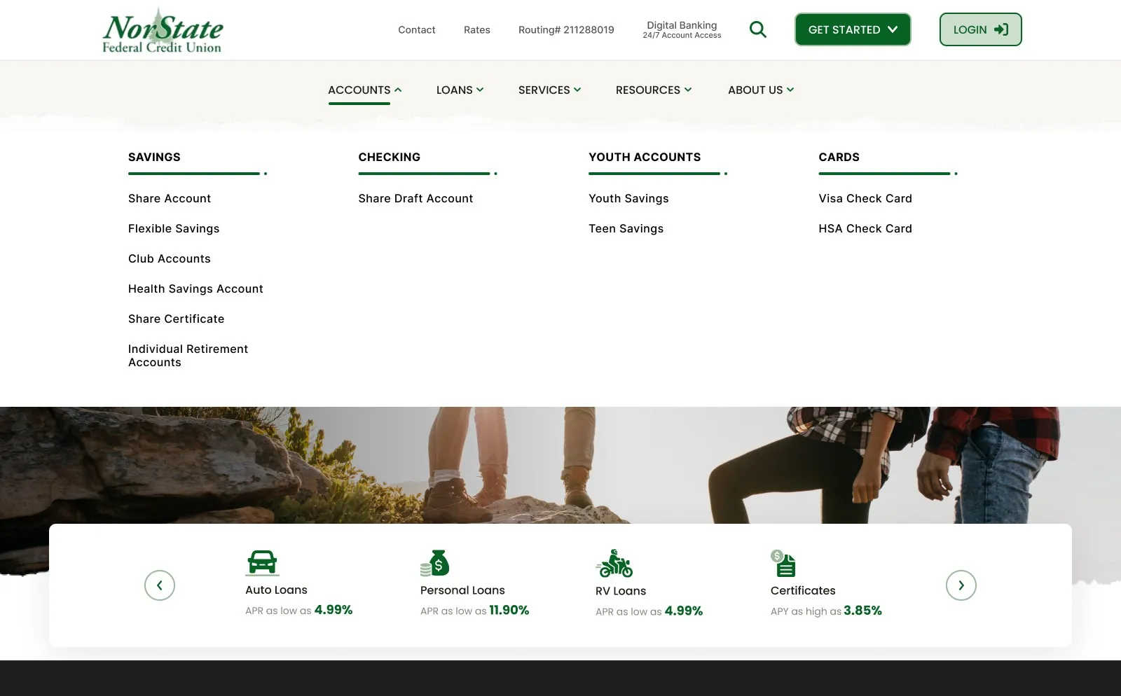
- Sitemap and navigation
- Homepage design
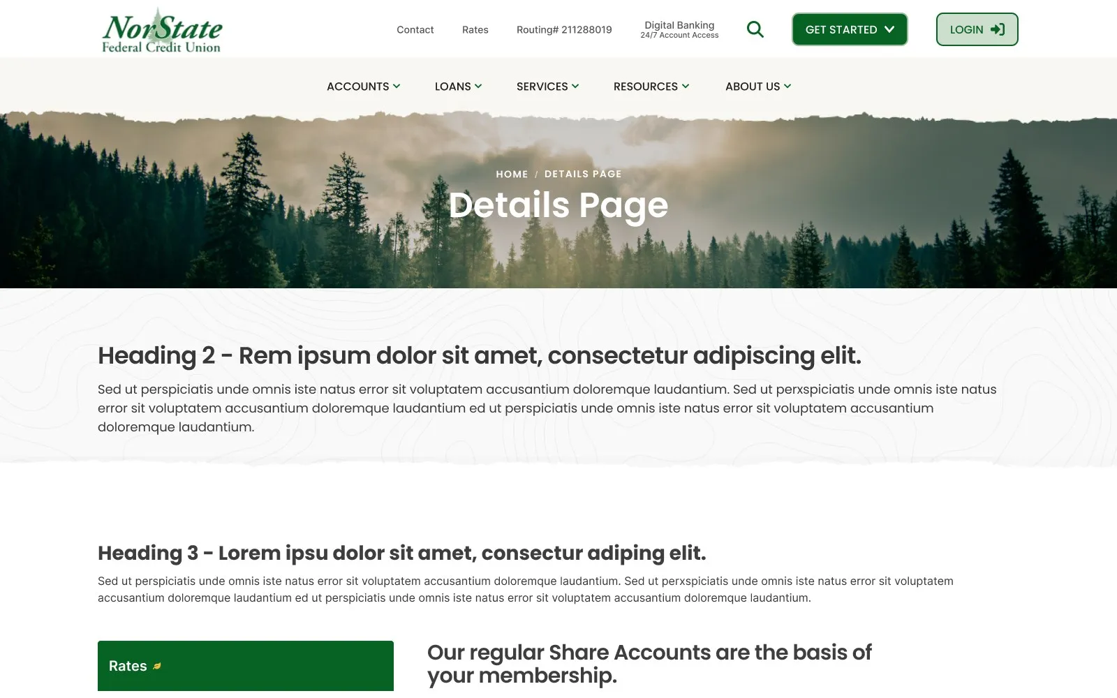
- List, product and details templates
- Reusable component set
03 Challenge
Three problems standing between members and the right next step.
- 01
Who NorState is, and who it’s for
Prospects didn’t understand eligibility, membership value or how a credit union differs from a bank. Trust-building information was buried or fragmented.
- 02
Navigation built around the org chart
Menus mirrored internal structure, not member intent. Finding the right loan, the rates or “what do I do next?” took too many clicks, especially on mobile.
- 03
Local warmth, modern expectations
Members expect easy online applications, fast answers and mobile-friendly pages, but the site didn’t carry the warmth of in-person service.
04 Approach
Client direction, used as a checklist.
What NorState asked for in the kickoff became a checklist for every design decision, and a new sitemap organized navigation around what members came to do.
- 01
Avoid
Dark backgrounds, a rotating banner, the “boxy” feel of the current site, and the diamond and square shapes in the old brand guidelines.
- 02
Aim for
Simple and easy to understand; more organic shapes and flow; subtle animation; professional, clean, fresh, not too much color.
- 03
Research
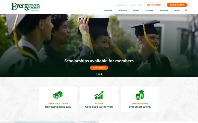
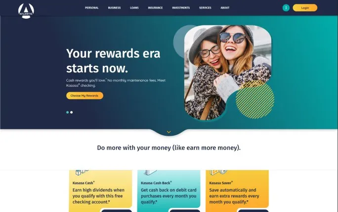
A review of four regional credit union sites, plus notes on the people NorState serves, shaped the tone before any layout.
- 04
Navigation
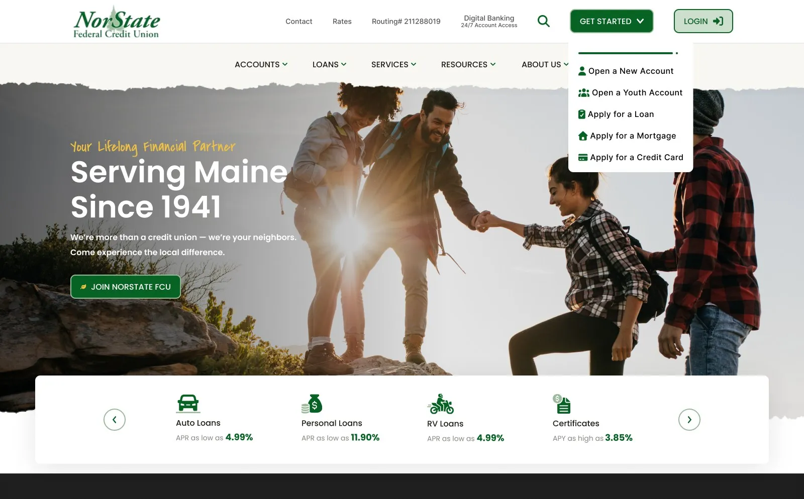
Accounts, Business, Loans, Services, Resources and About Us, with a Get Started menu for the four most common jobs.
05 Visual exploration
Northwoods green, harvest gold and a hand-written welcome.
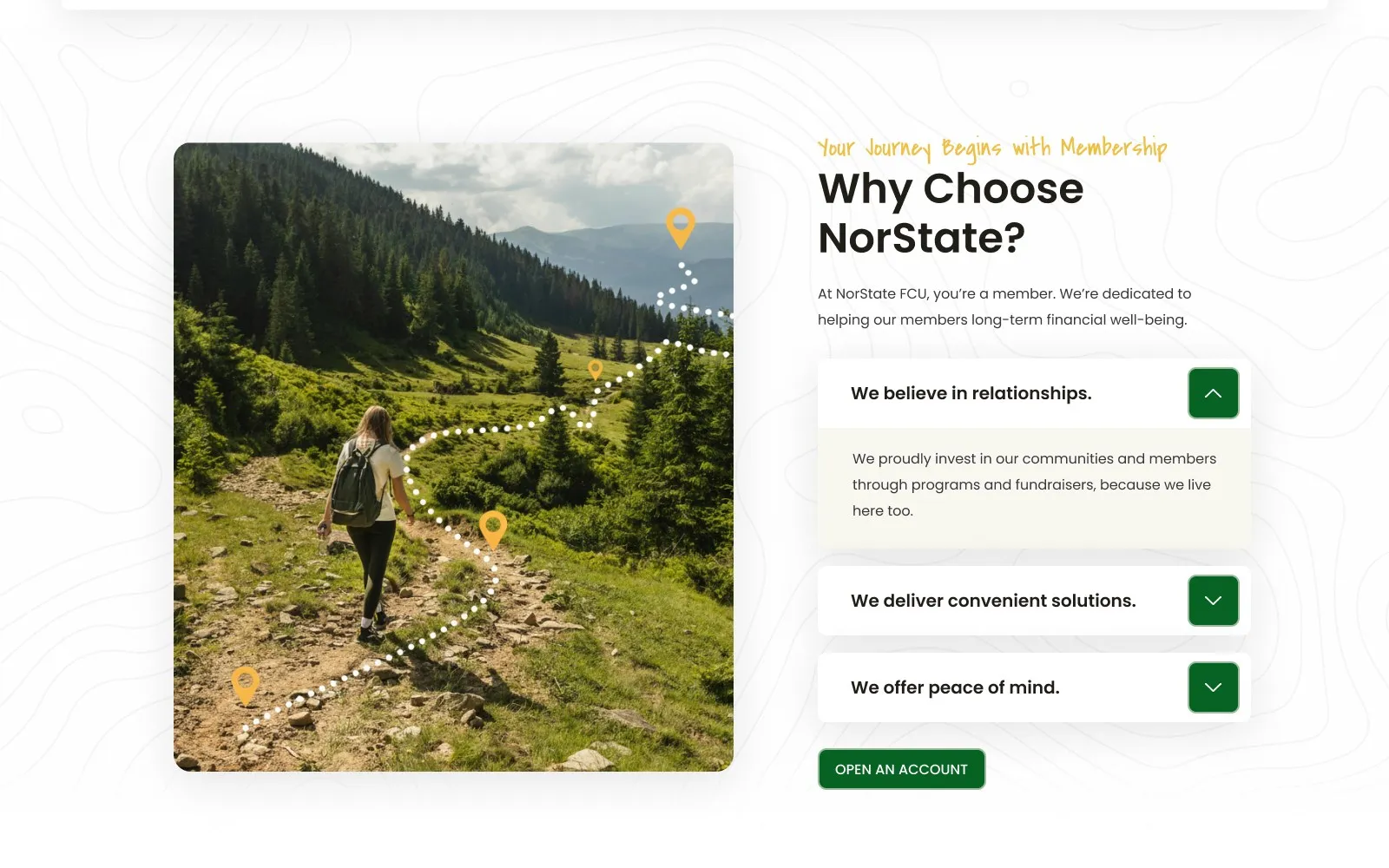
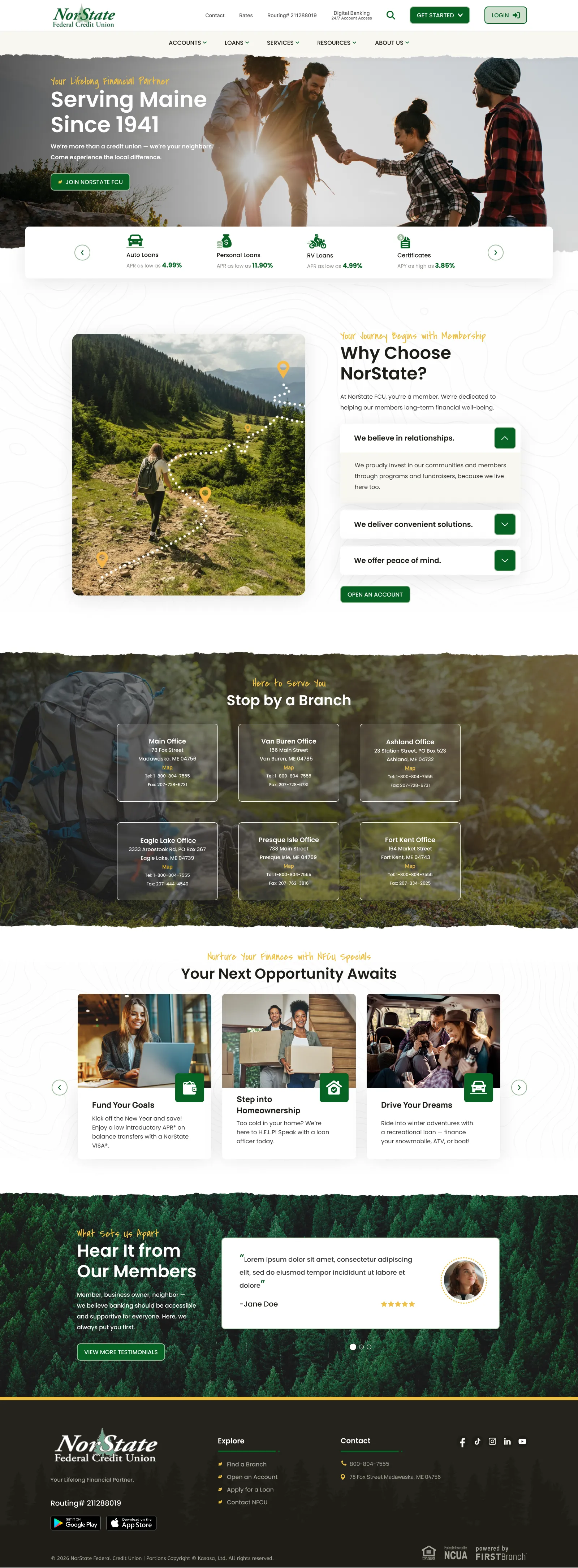
No dark backgrounds, no boxes: torn-paper section edges, topographic line work and a dotted trail with map pins make the page feel like the landscape it serves.
06 Final designs
One scroll tells the whole story.
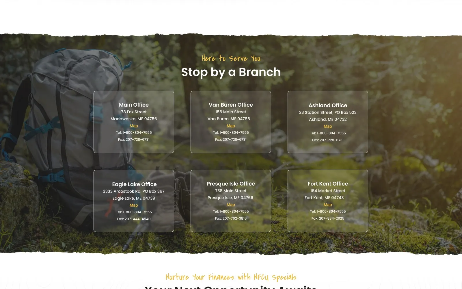
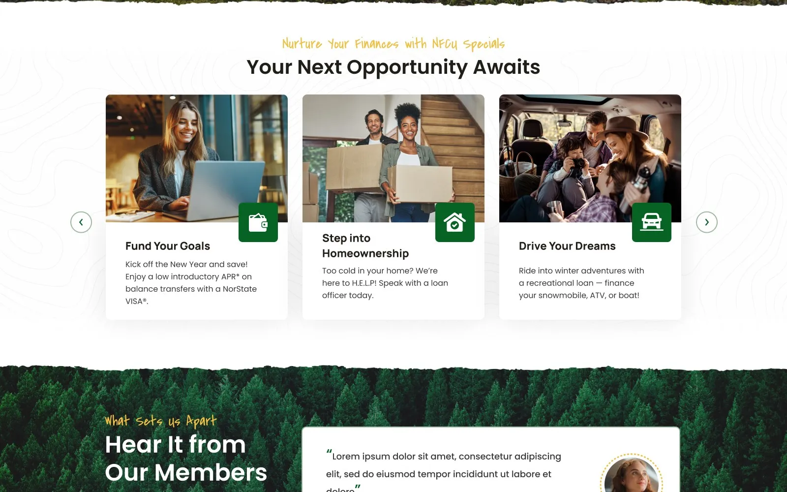
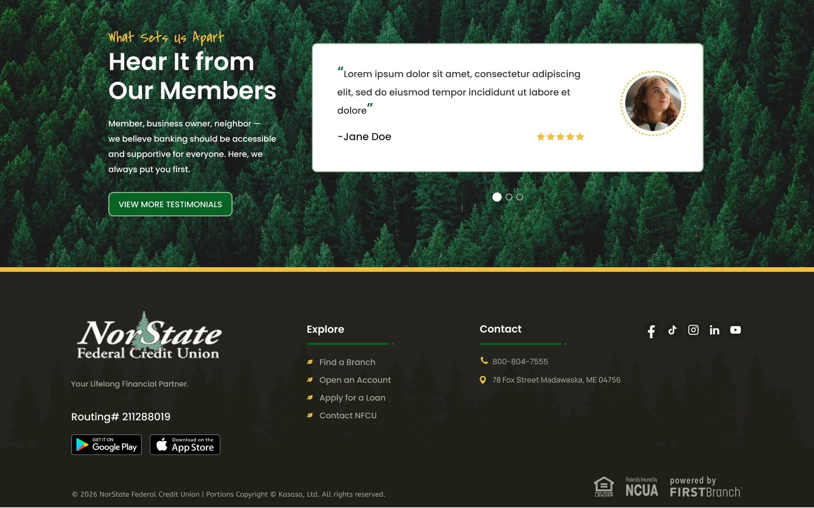
Photography of real Maine places carries the page, and every section ends with one clear action: a single Join NorState FCU button up top, rates in a quiet strip, branches, products and member stories below.
07 Design system
Benefits first, details second.
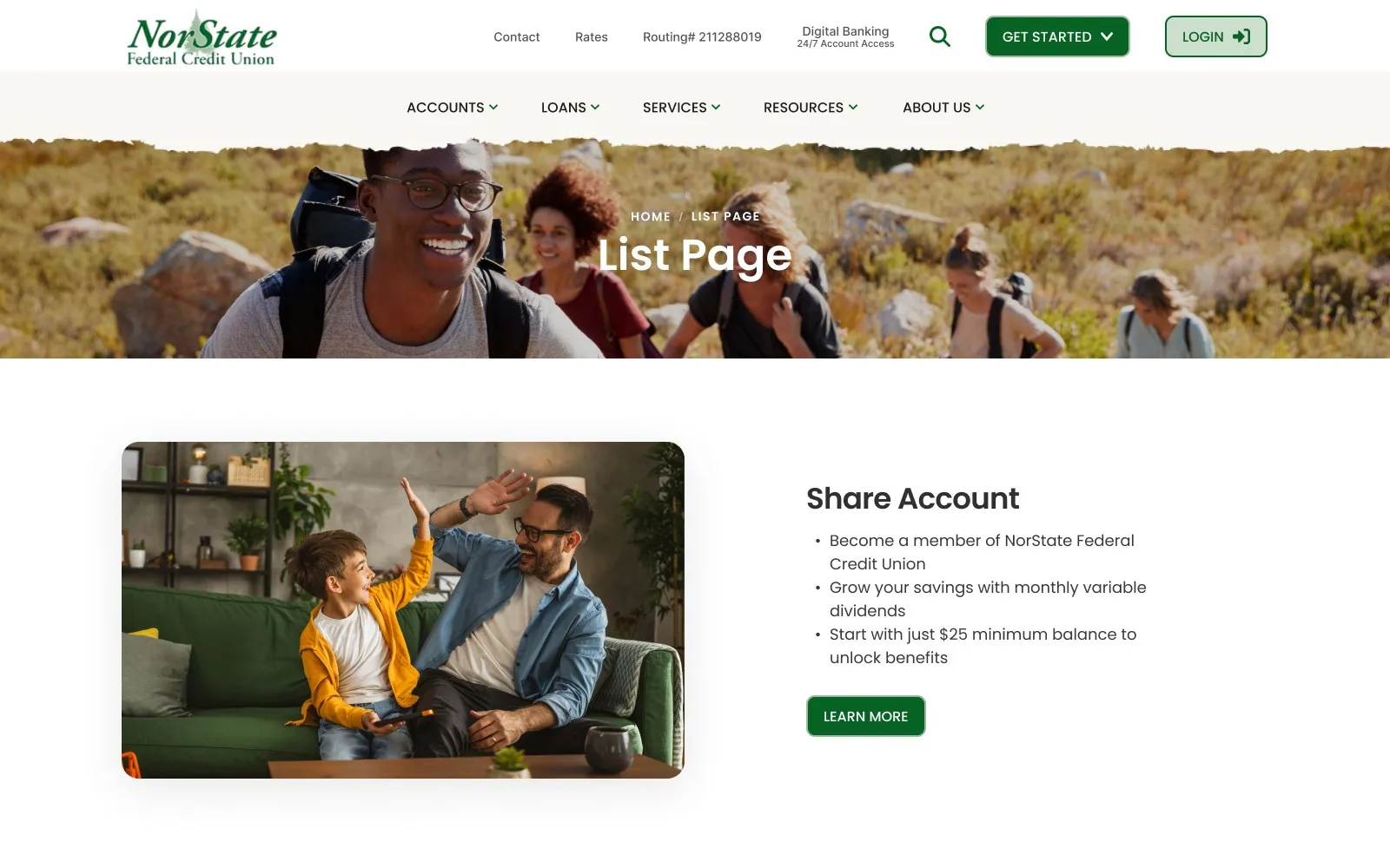
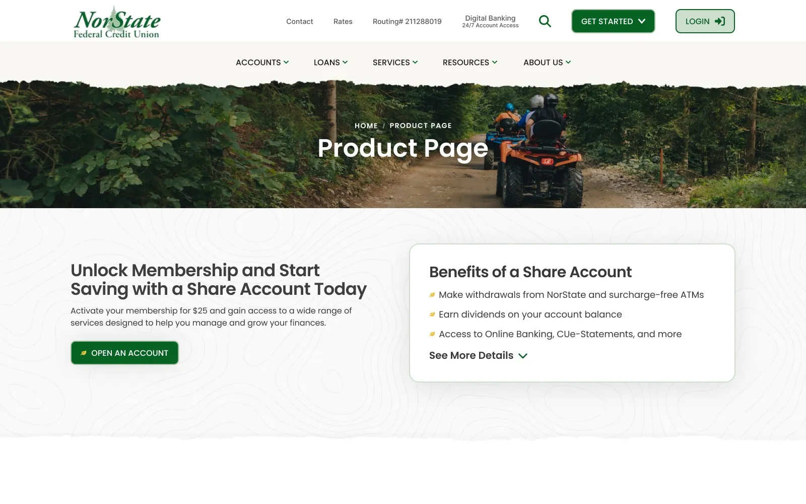
Downstream pages follow the brief: plain-language explanations, scannable rates and terms, and clear next steps, all built from a small component kit so new pages stay on-brand.
08 Outcomes
Ready for development.
The design file is marked Final → Dev. Counts come from the file; post-launch results stay as placeholders until confirmed.
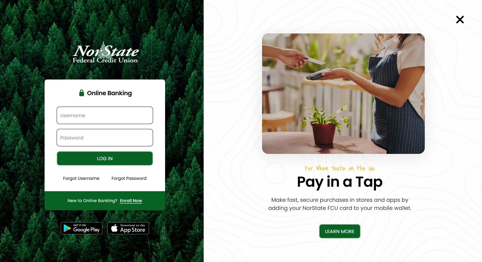
- 5Page templates: homepage, list, product, details and online banking login.Source: Designs page
- 6Branch locations surfaced on the homepage.Source: Homepage design
- 3Navigation patterns: mega menu, mega navigation and Get Started.Source: Designs page
- [Result]New memberships or applications after launch.Add only once confirmed
09 Reflection
“The NorState website should feel like a trusted local partner — built for the people who live here, work here, and plan to stay here.”
[One or two honest lessons from the project: what you would keep, and what you would change.]